Alright, this got out of hand quickly. So I’ve just started with EVERYTHING, because that’s always the best place to start and then you can say ‘don’t be mental I can’t do all these’ or ‘we’ve already done a million Erasers and No Surprises etc etc’ I can whittle down to suit the actual brief. If there was a brief. Maybe I’m just taking the lightest excuse to get all my records out.
But here you go anyway, digest at your own speed…..
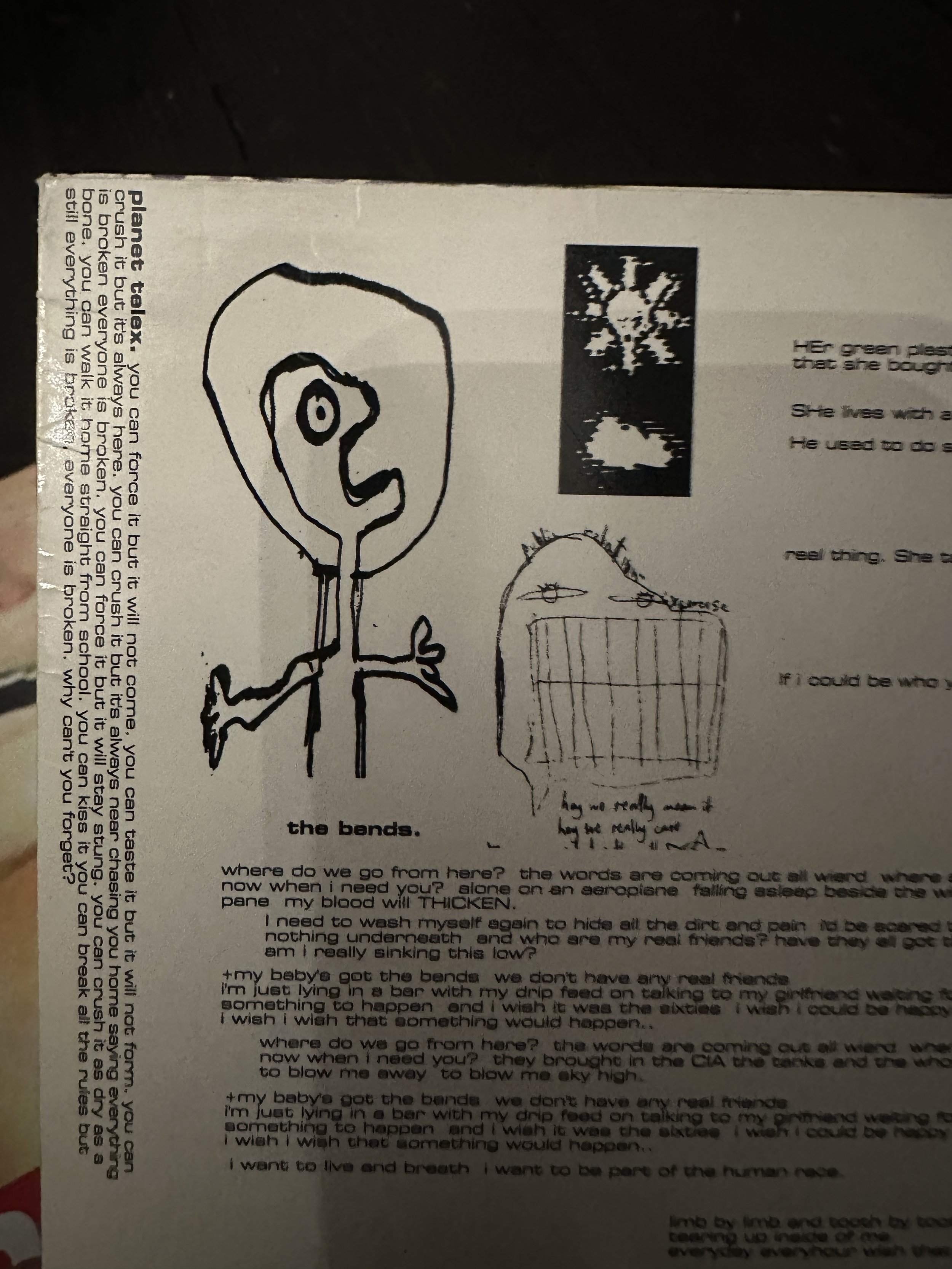
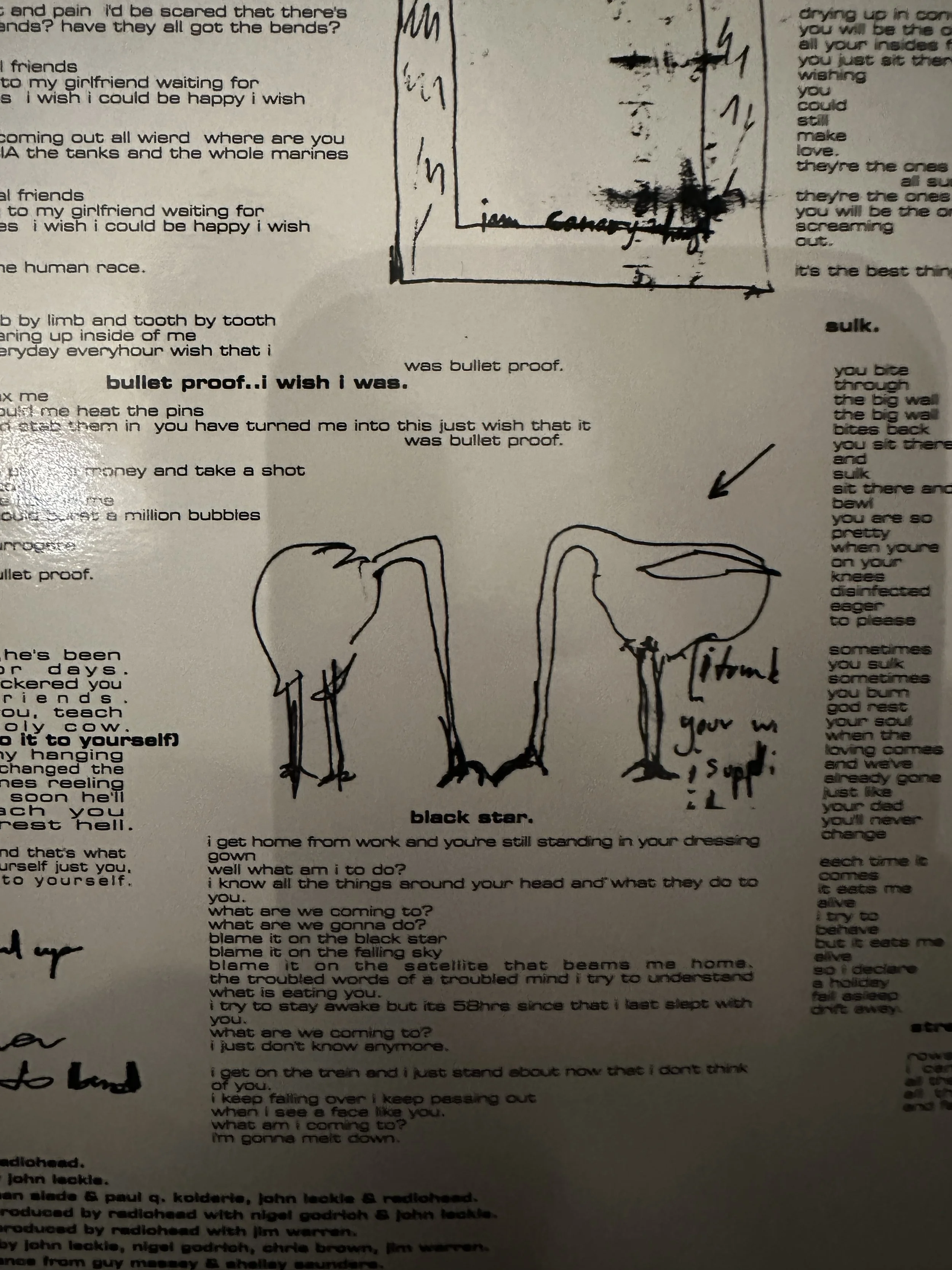
The Bends
Tricky. Album means an awful lot to an awful lot of people, but they’re pretty odd images to hang on your wall. I made versions with no text of the Bends cover and of Fake Plastic Trees just to see. You could get away with them, they don’t really fit with anything else stylistically but have their own look. Not 100% sure I’d jump on them. Don’t feel like Donwood.
I do think a lot of the weird scribbles from this time all over the sleeves and centre labels would make really great monochromes postcards/mini prints etc. But can look at later.
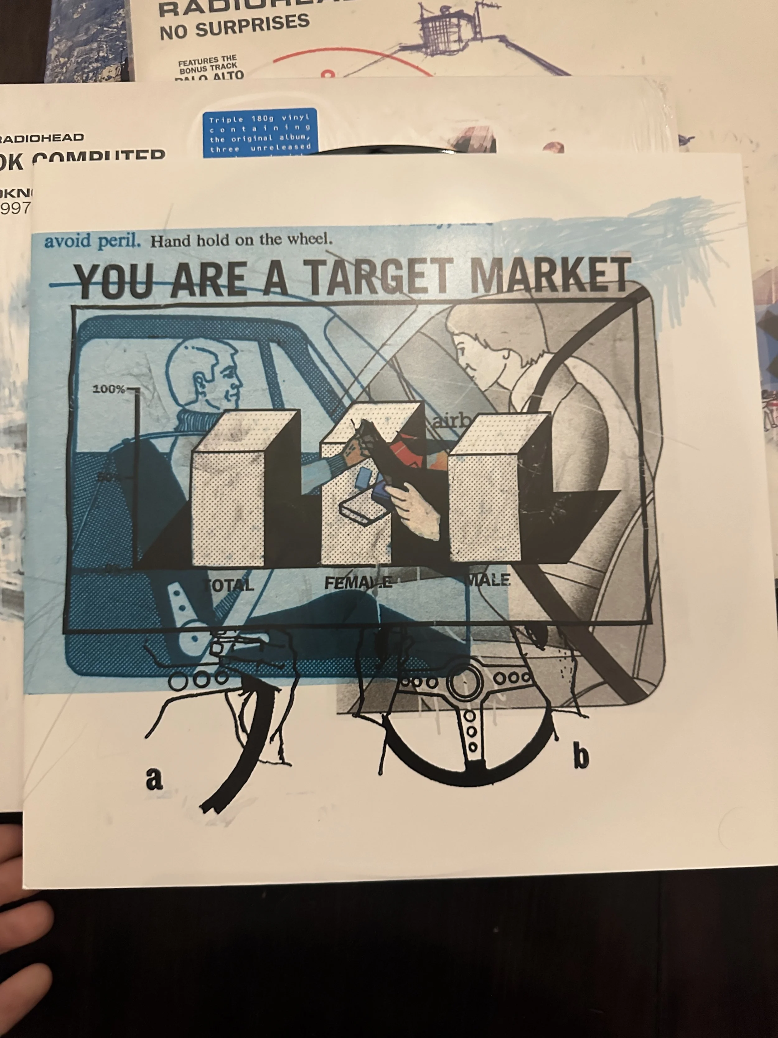
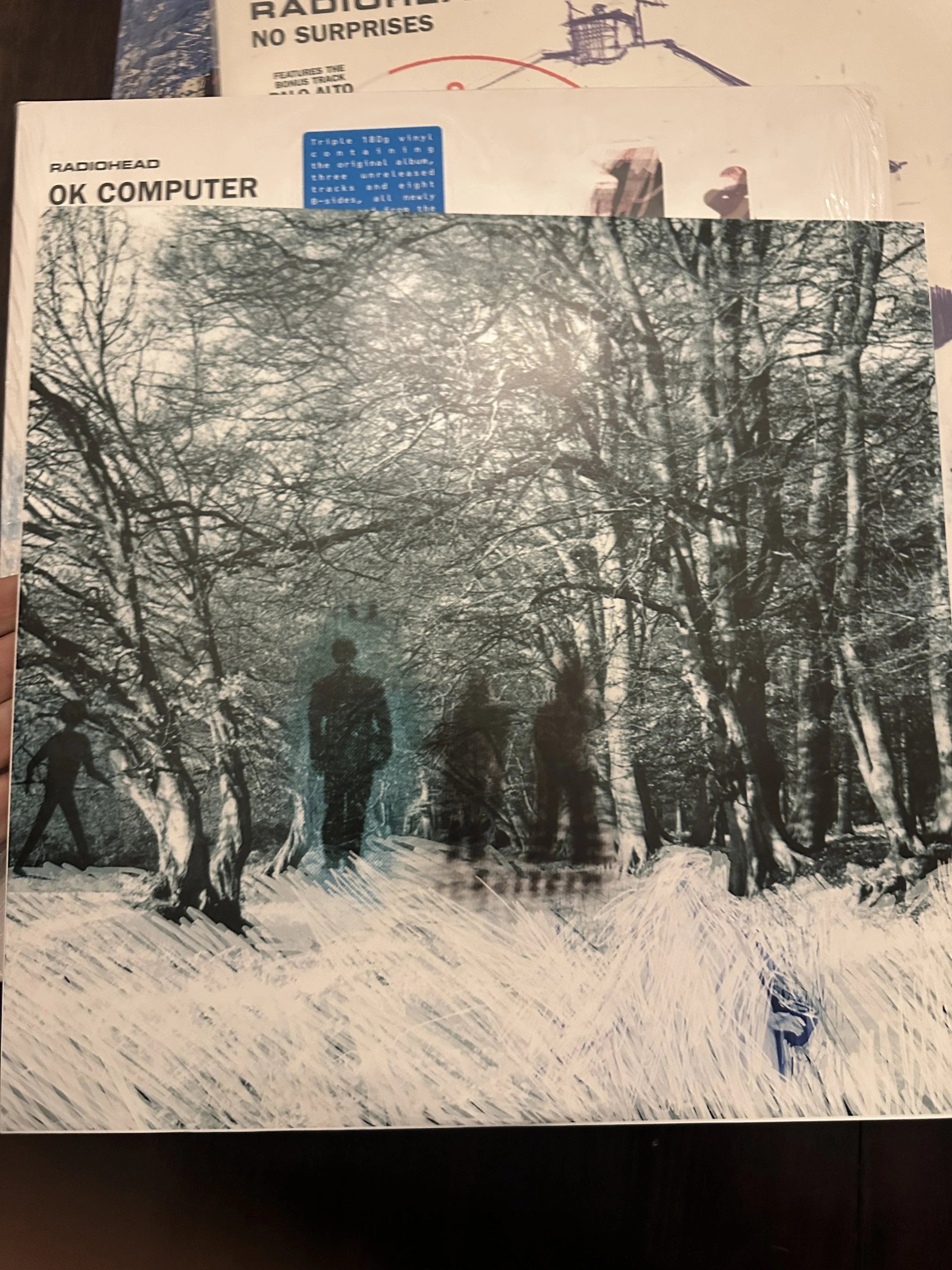
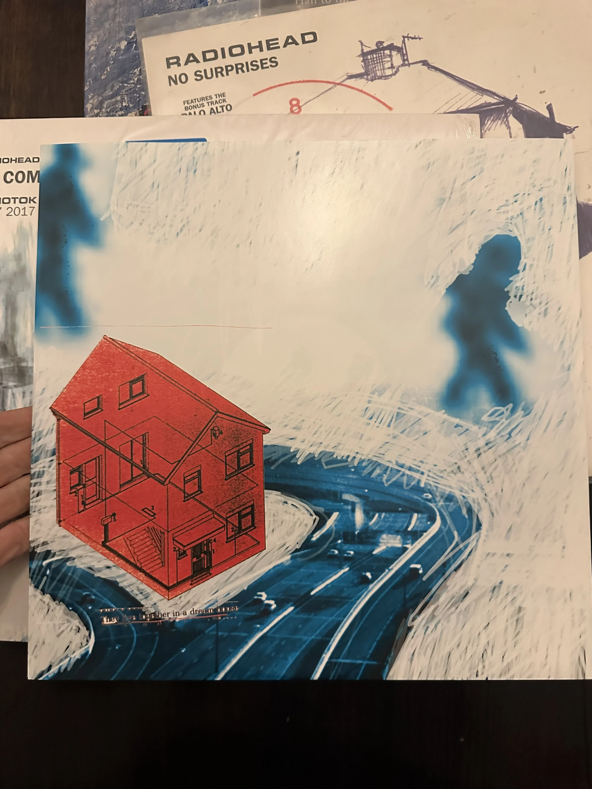
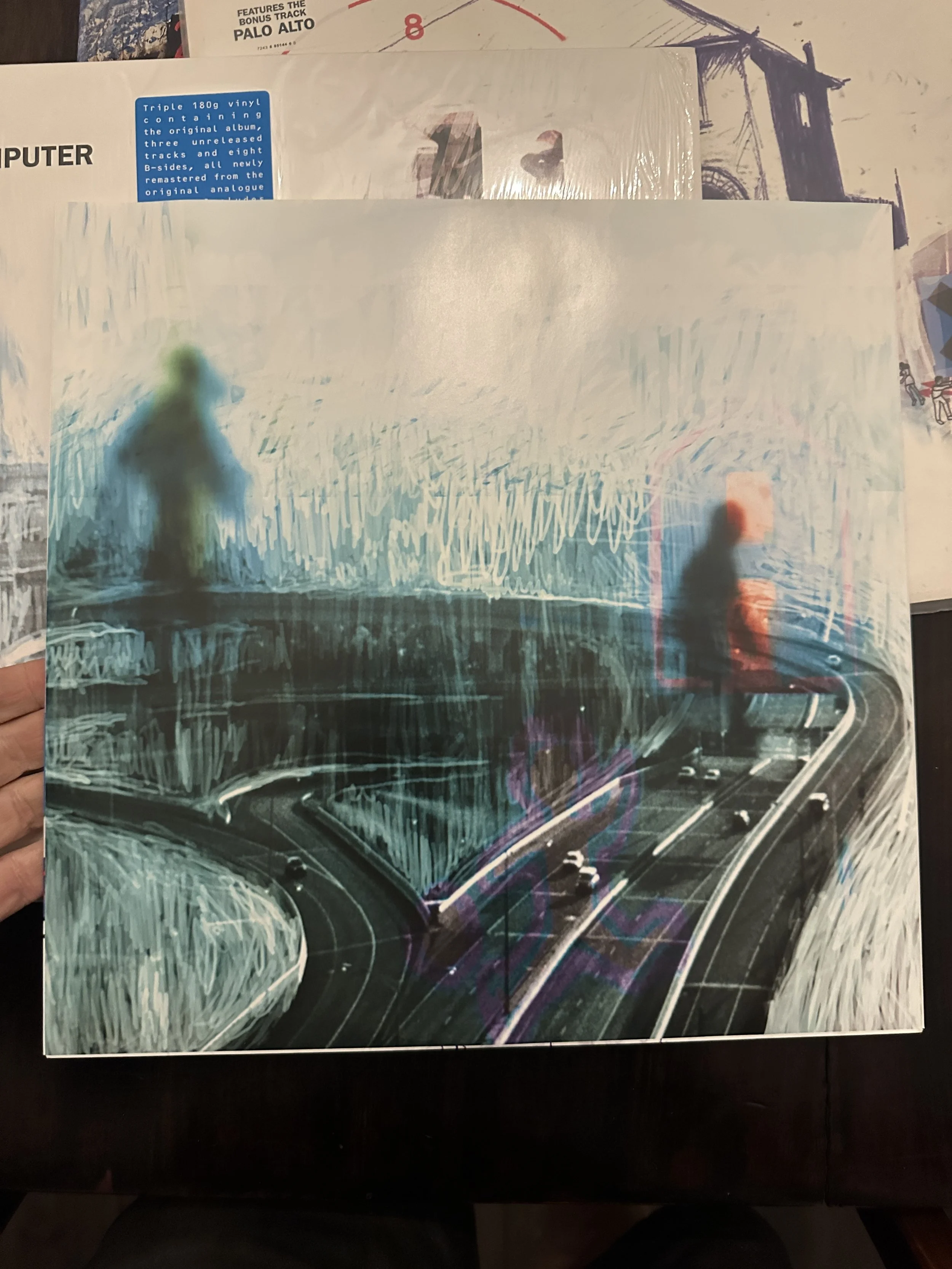
OK Computer
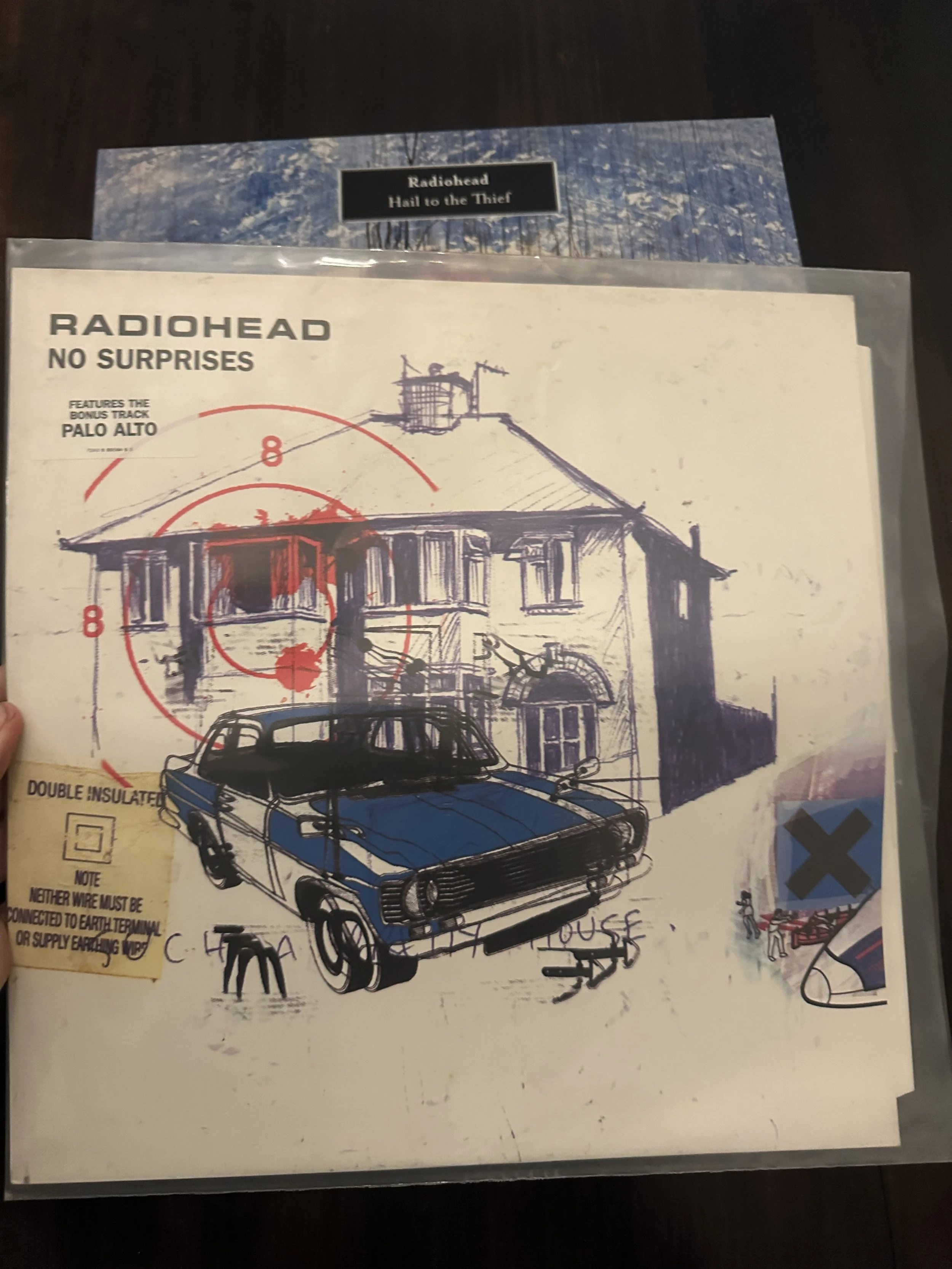
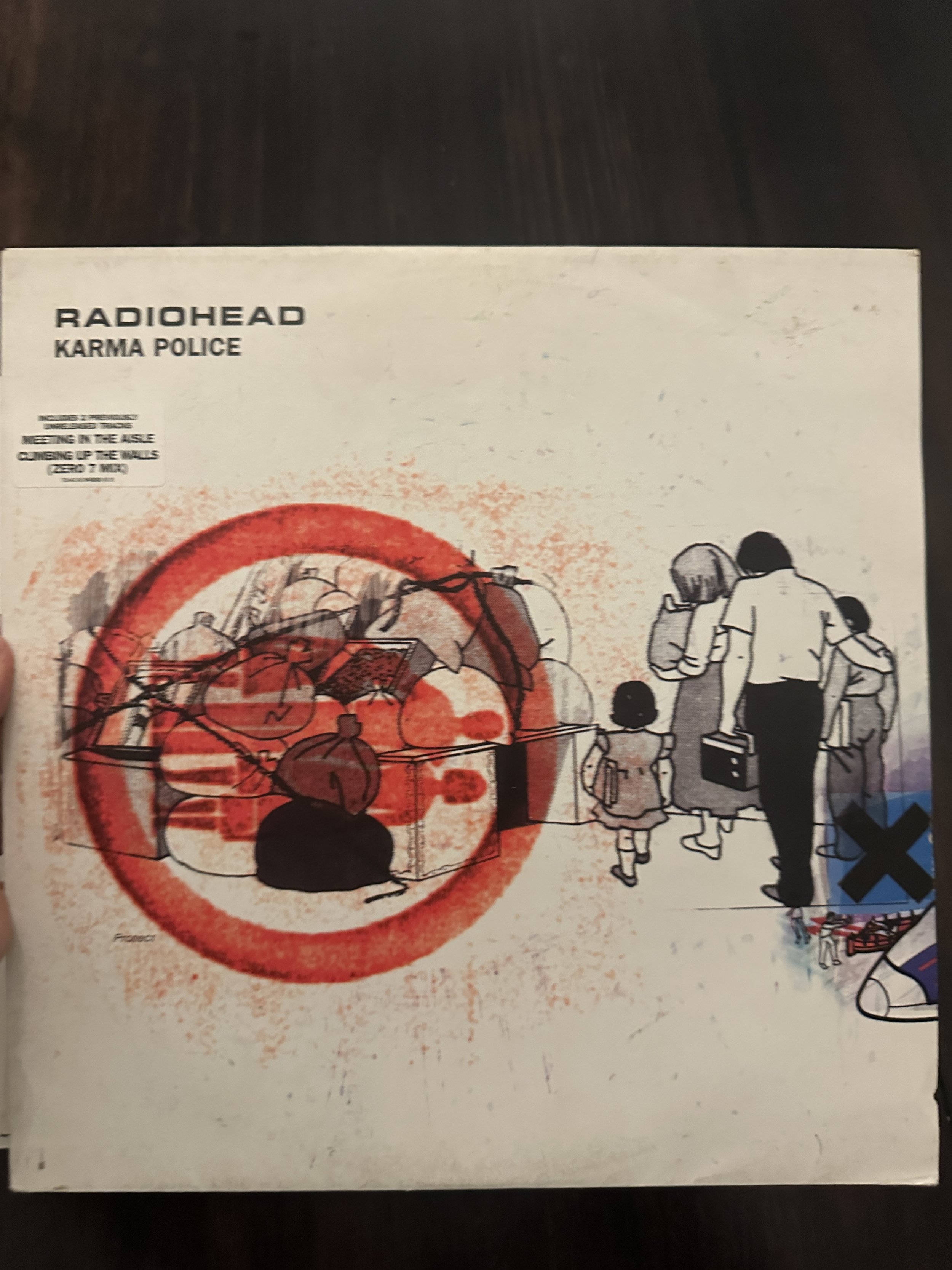
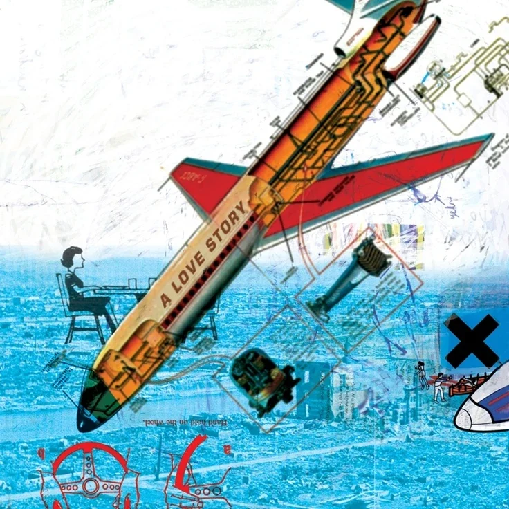
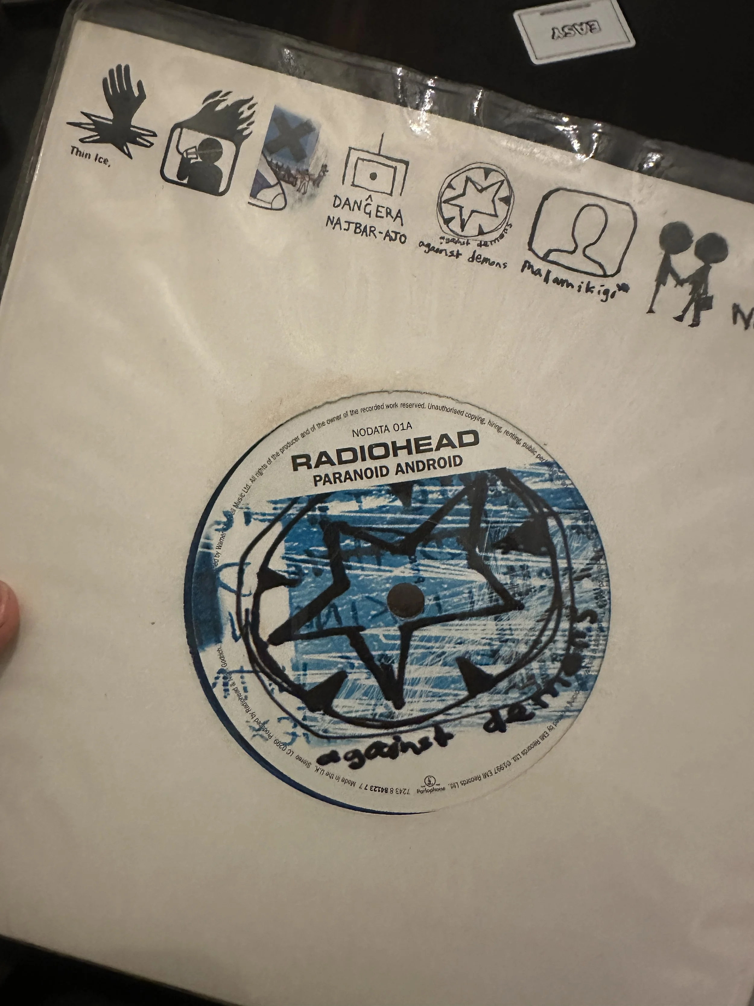
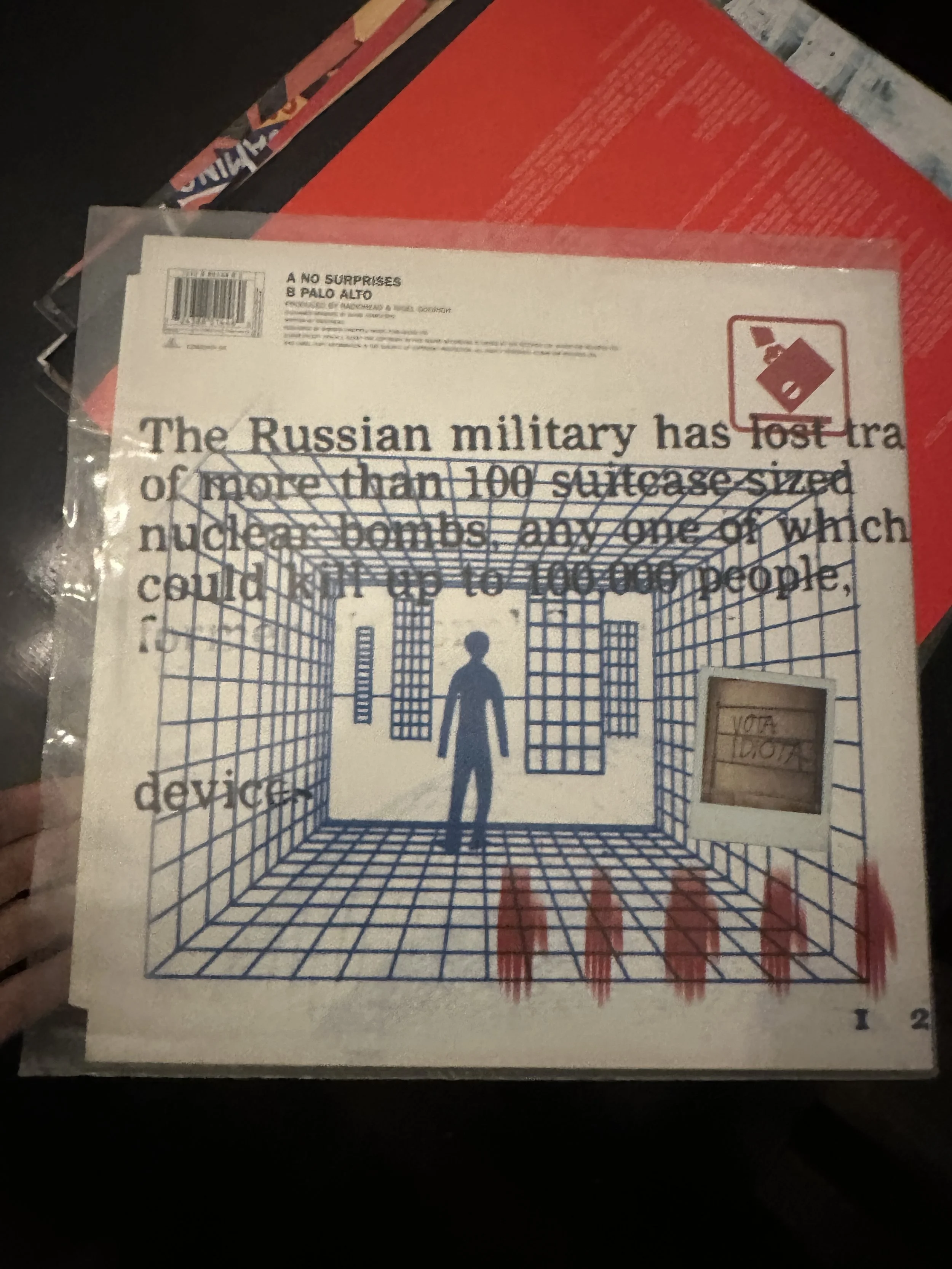
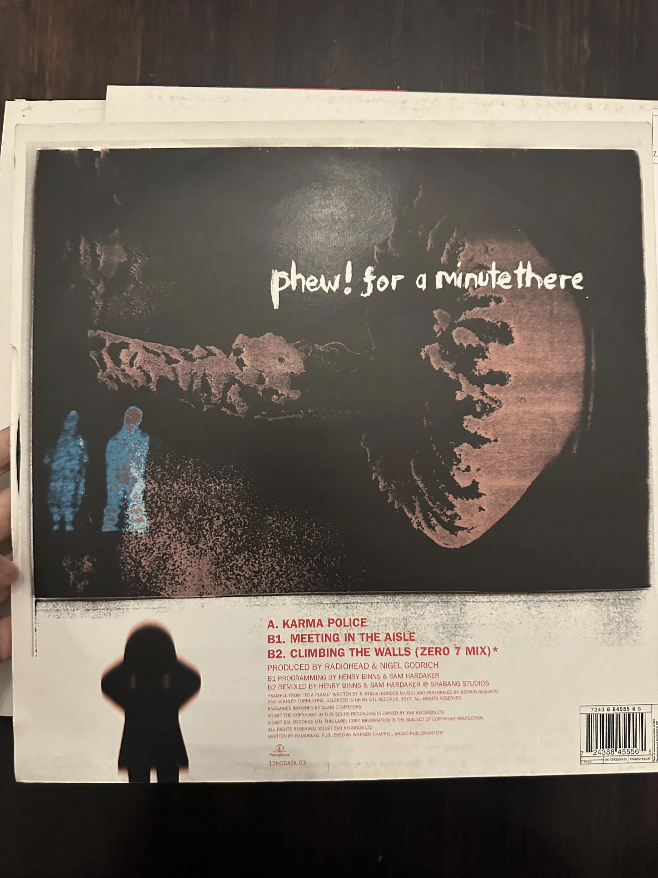
This one is a doozy. Aside from being their biggest album it’s also got all the artwork style that is most associated with the band. I know you’ve done loads of them already, which I’ve included anyway plus some other bits that would look mint. I forgot the actual cover but you already know that one….
You Are A Target Market was used as the cover of their Meeting People is Easy DVD, that’s a great image and very well known. The last three are the Paranoid Android 7” and the back sleeves of No Surprises and Karma Police, which again I think have good elements for some monochrome mini prints or cards.
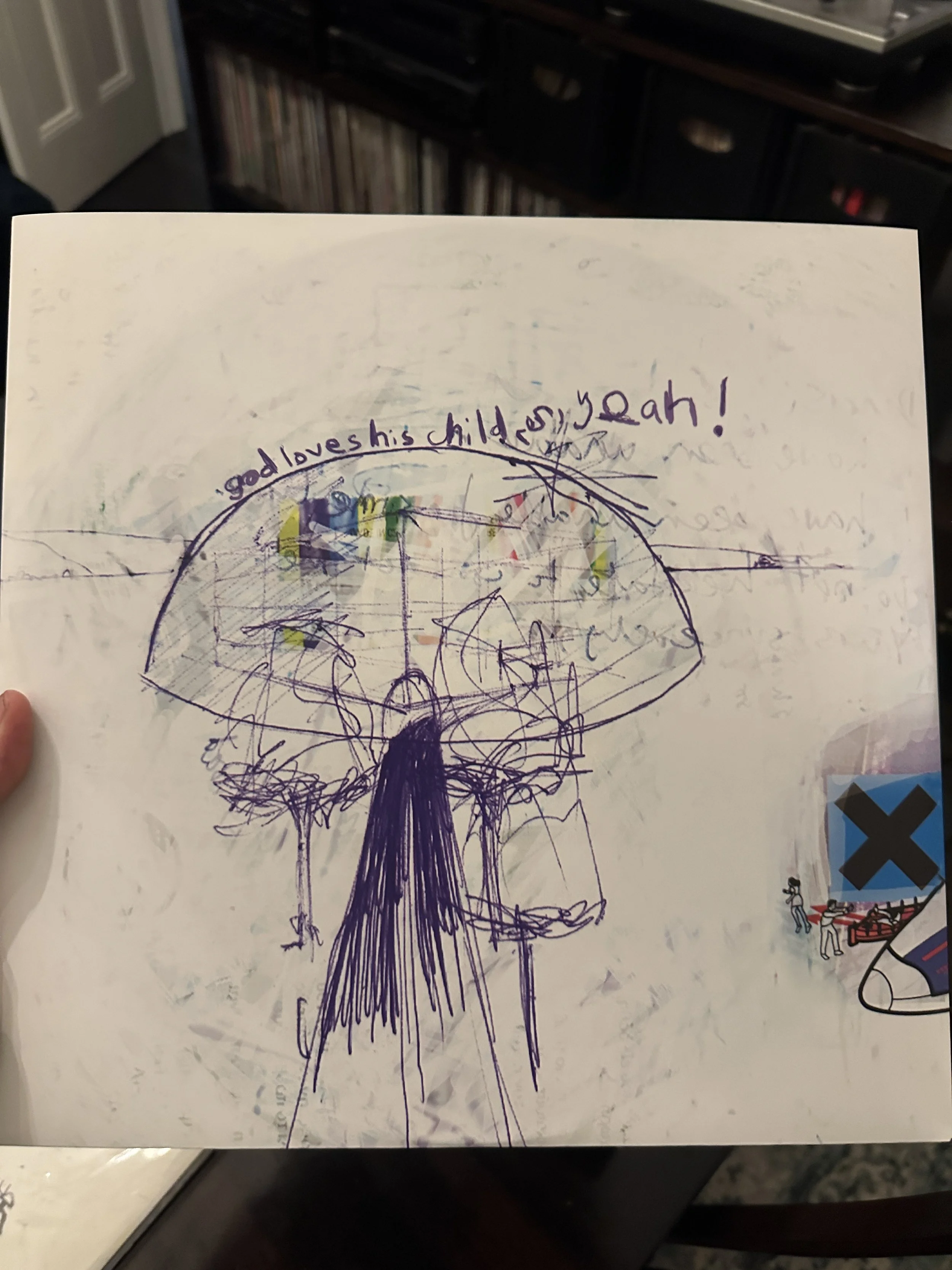
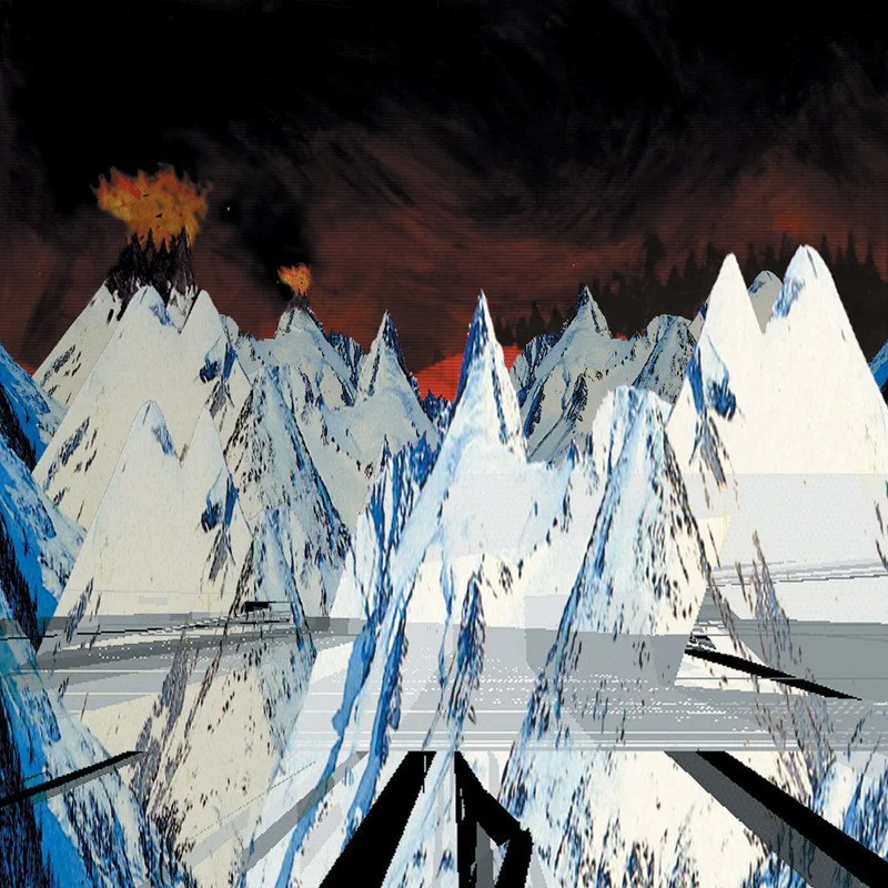
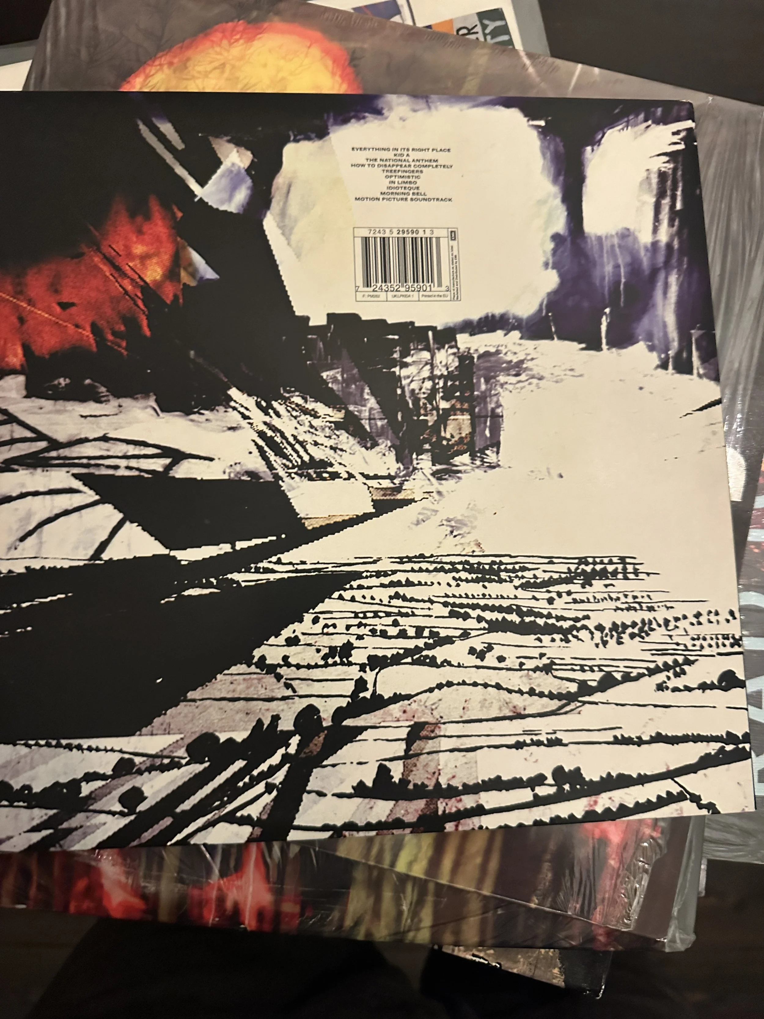
Kid A
Not a hugely strong period artistically. The cover is good, even without text, I’d probably buy that even though it looks like it was done in Microsoft Paint. Back cover is okay. Not much else unless you did bits from the comic book hidden inside the CD. I know there’s a lot of painted outtake stuff from this time, but the fans don’t care as much if it doesn’t look like an album. He said, with no proof at all.
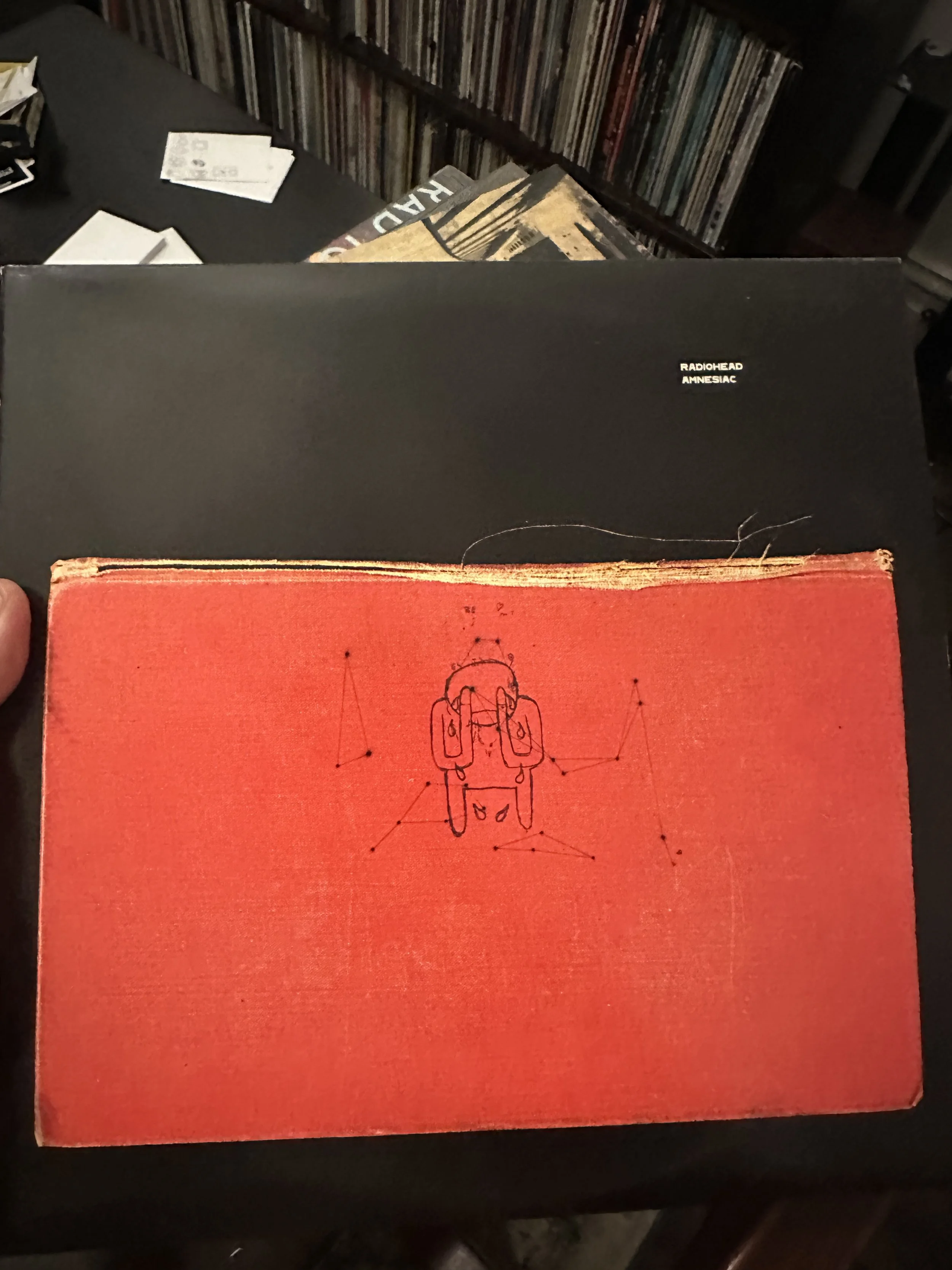
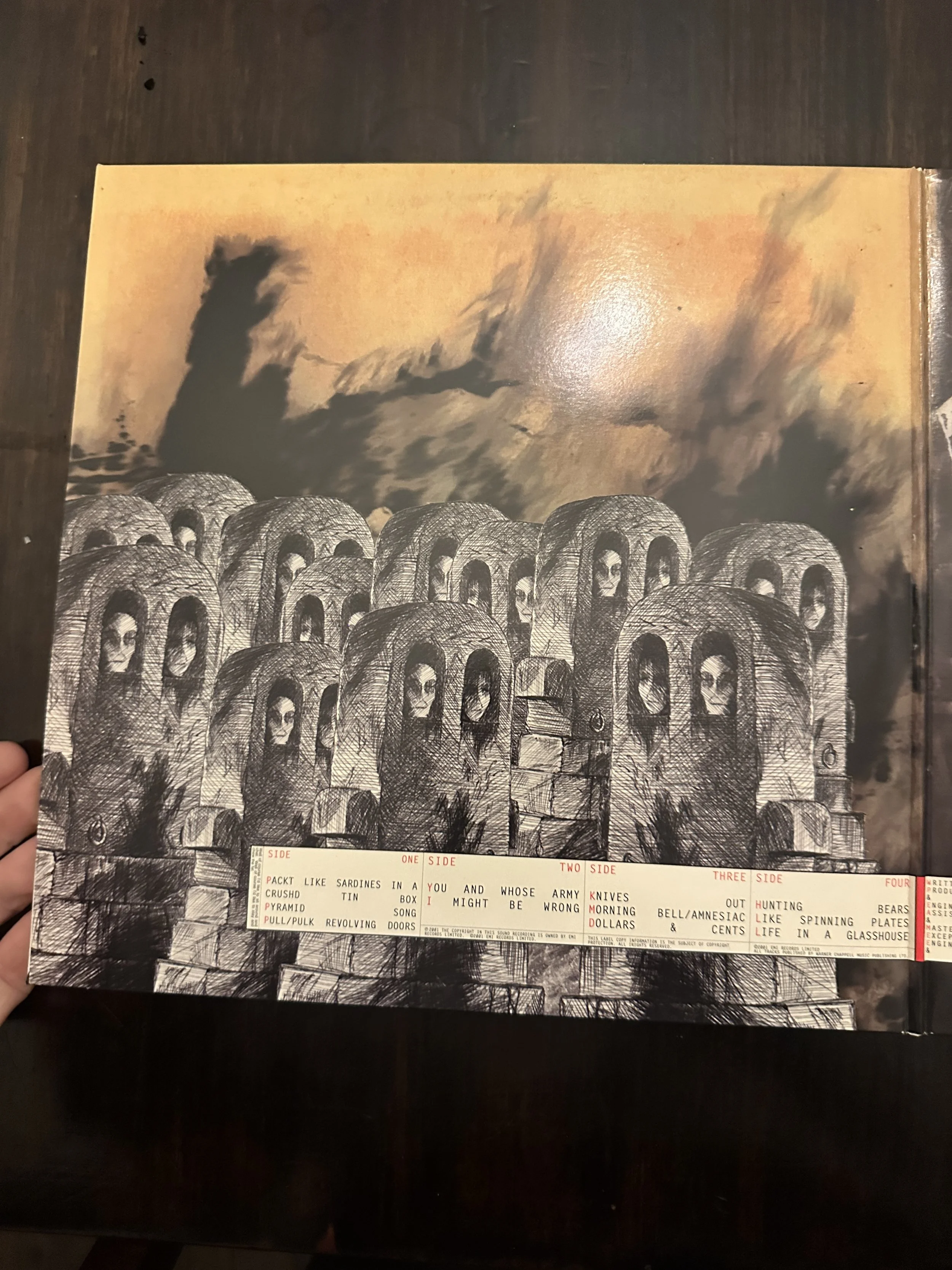
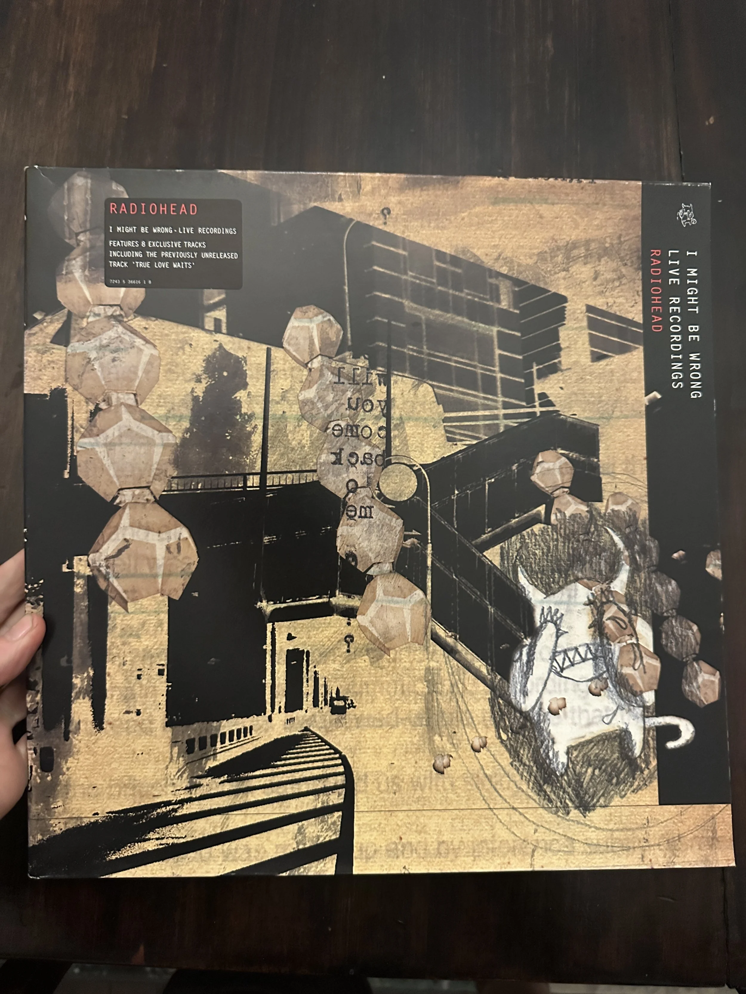
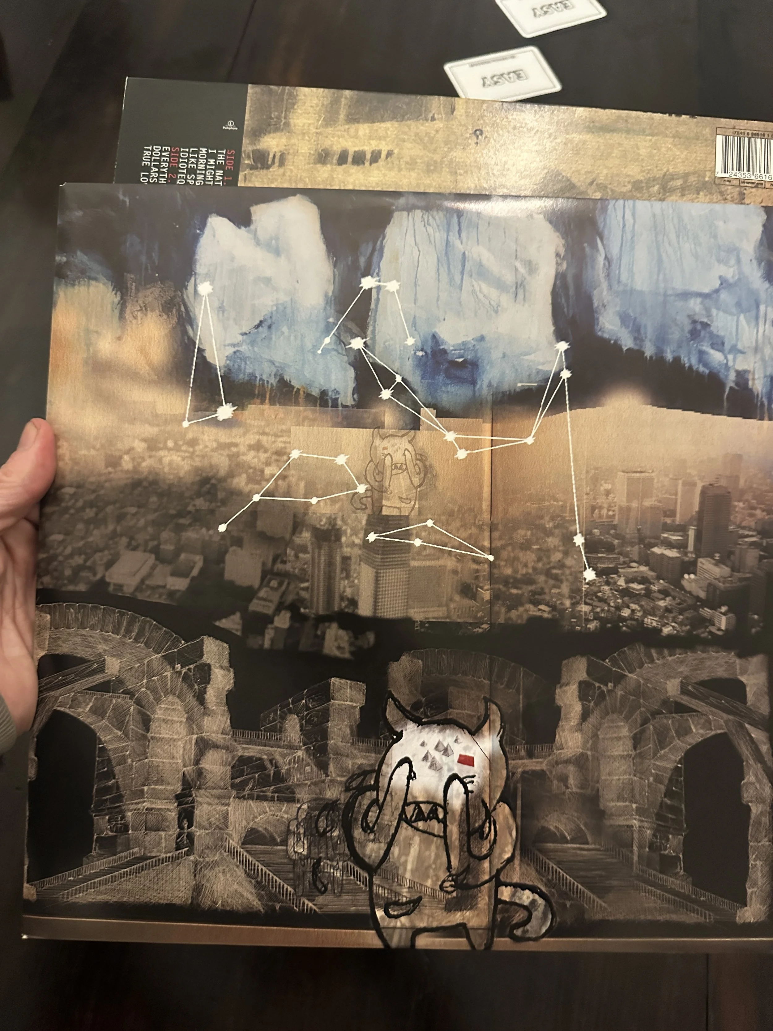
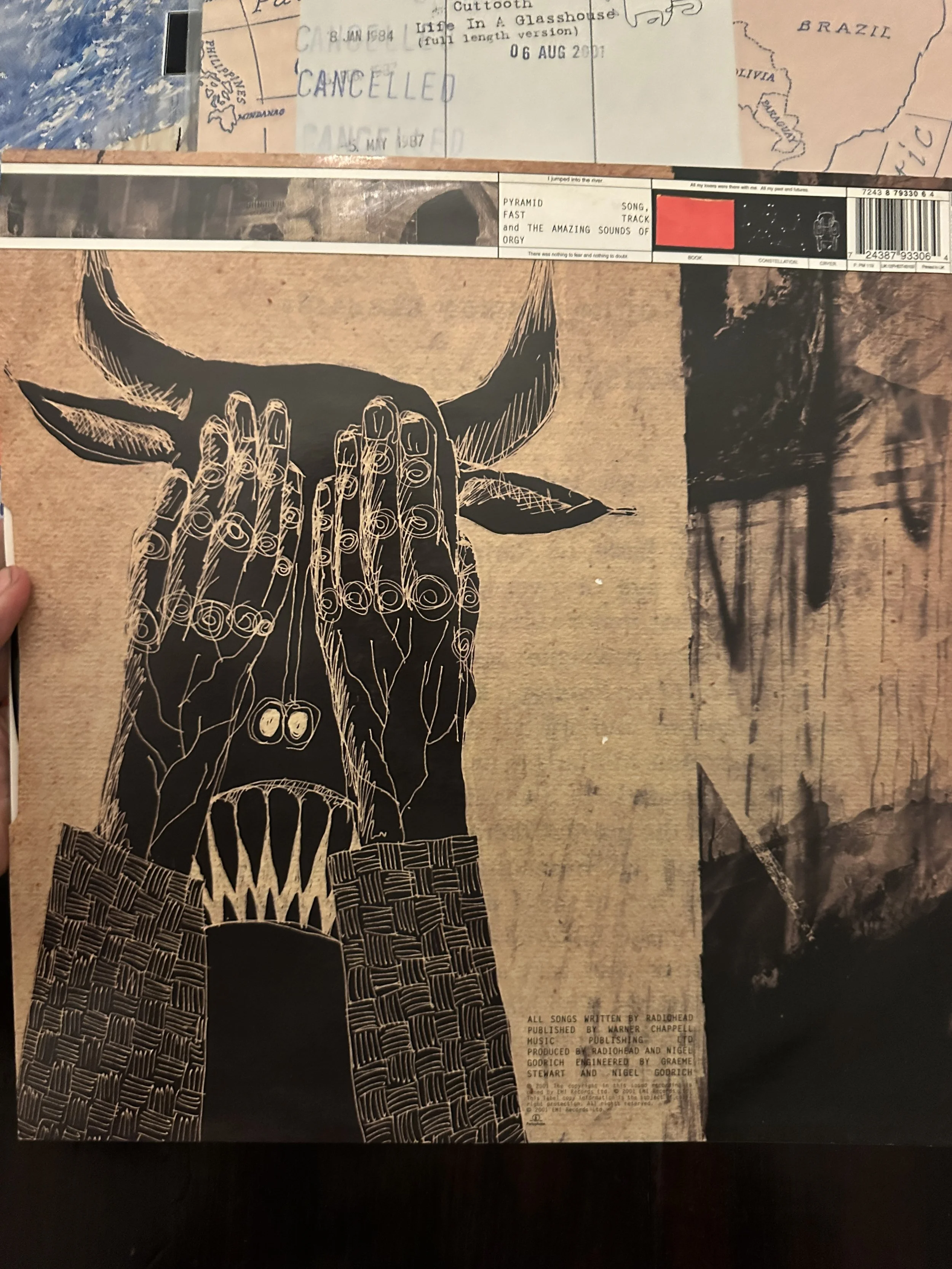
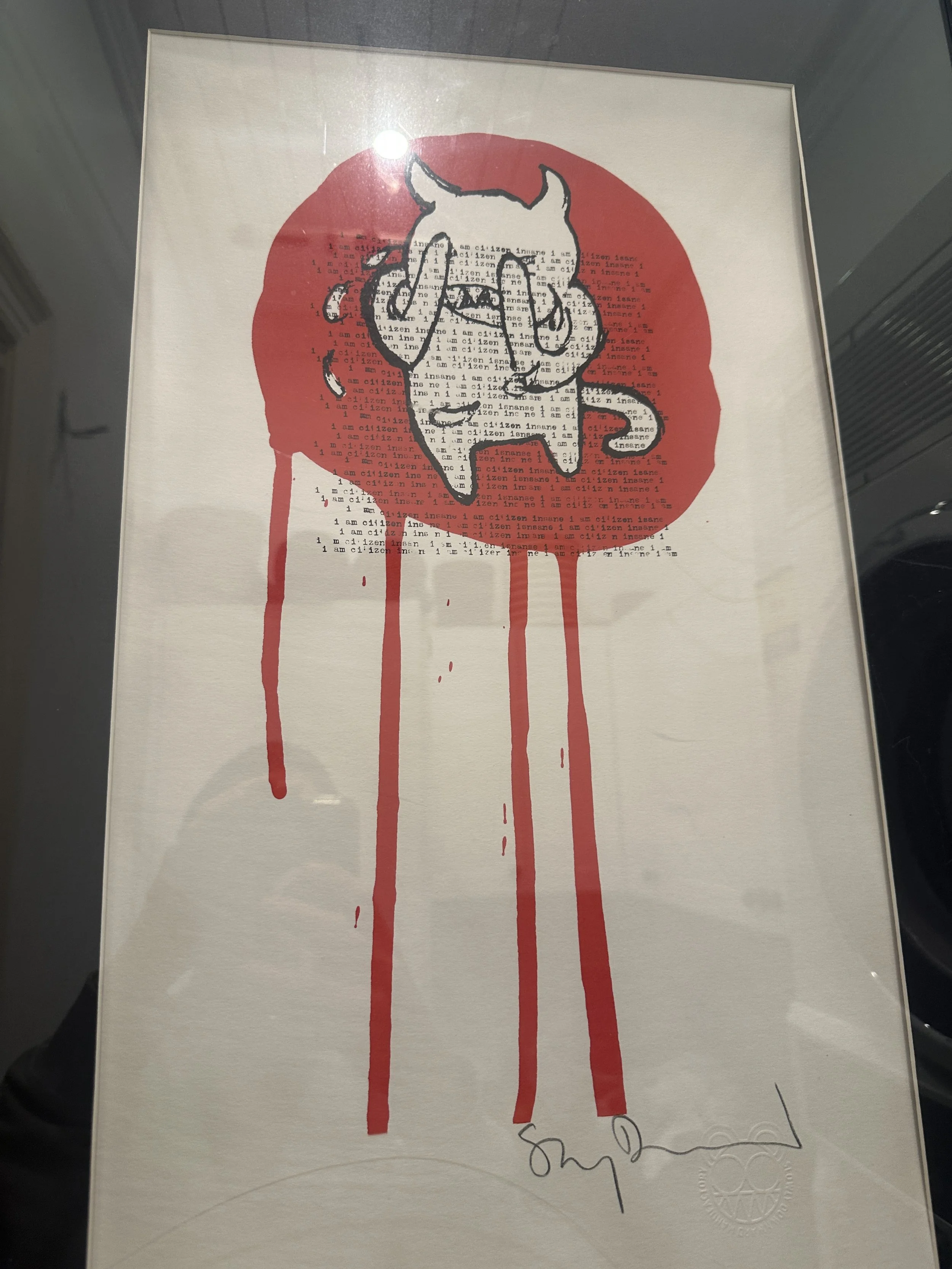
Amnesiac
Much more to pick from here, especially if you include I Might Be Wrong. Actual cover doesn’t work too well, maybe could do a notebook with it the Minotaur gold embossed on? But the Crying Minotaur print is great and sort of the same thing. (Mine is in my laundry, which sounds weird but it’s one of our most used rooms, and a great place to cry but you don’t because he’s there to cheer you up.) All the pencil stuff from the 12” singles is great.
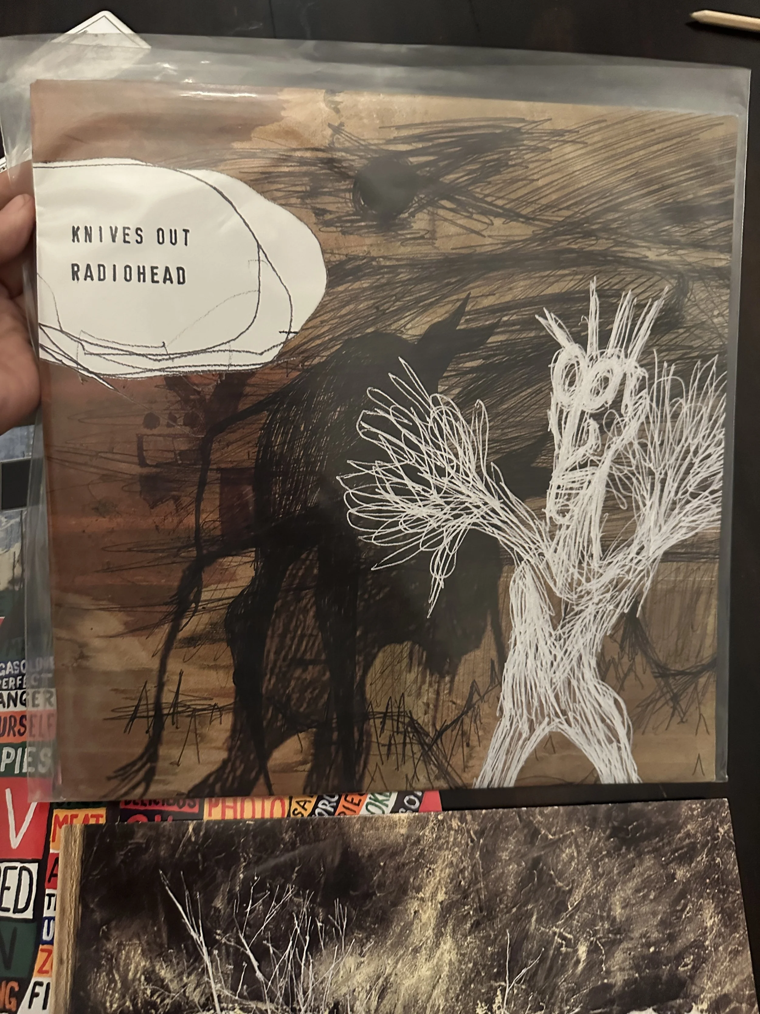
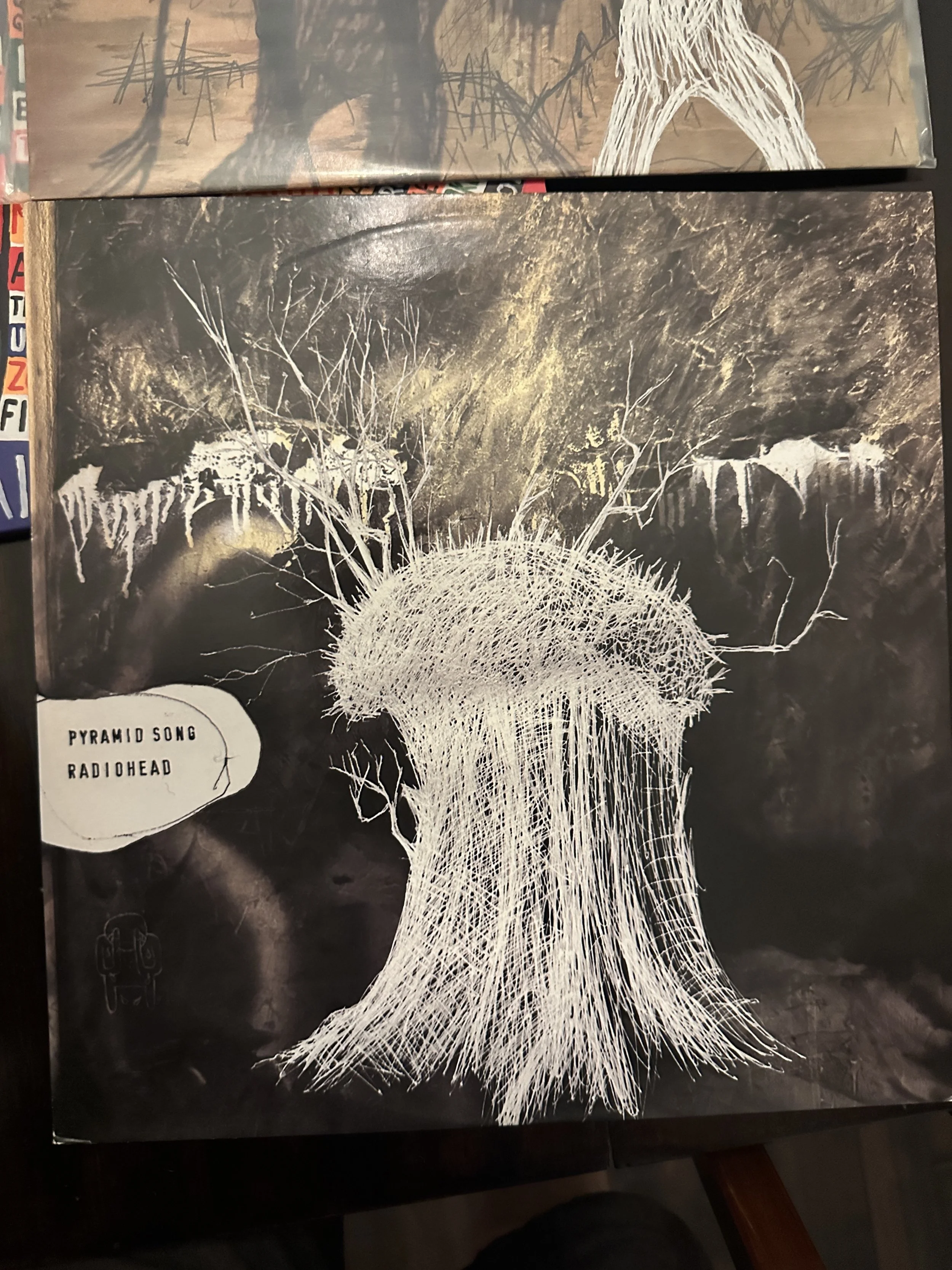
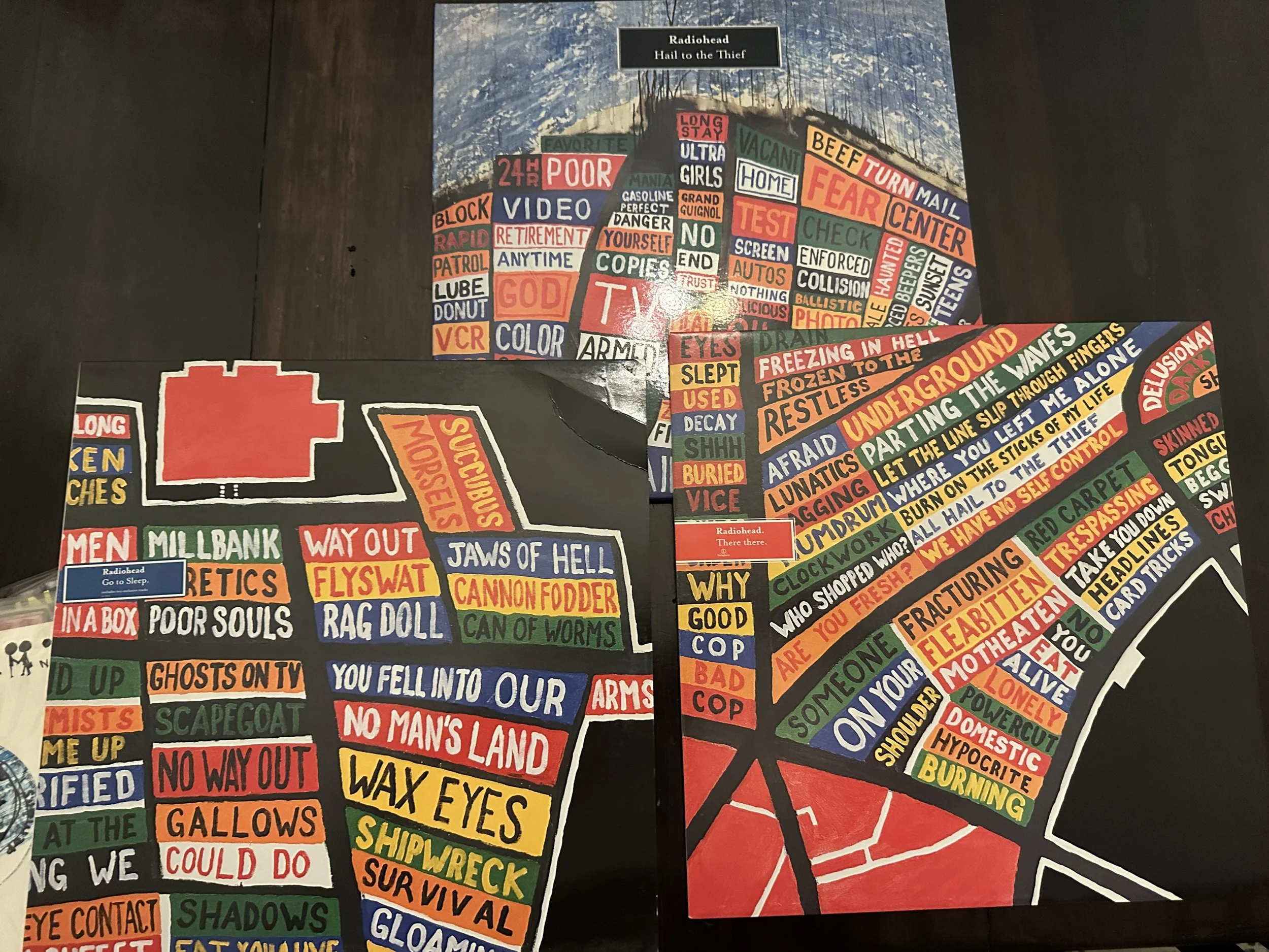
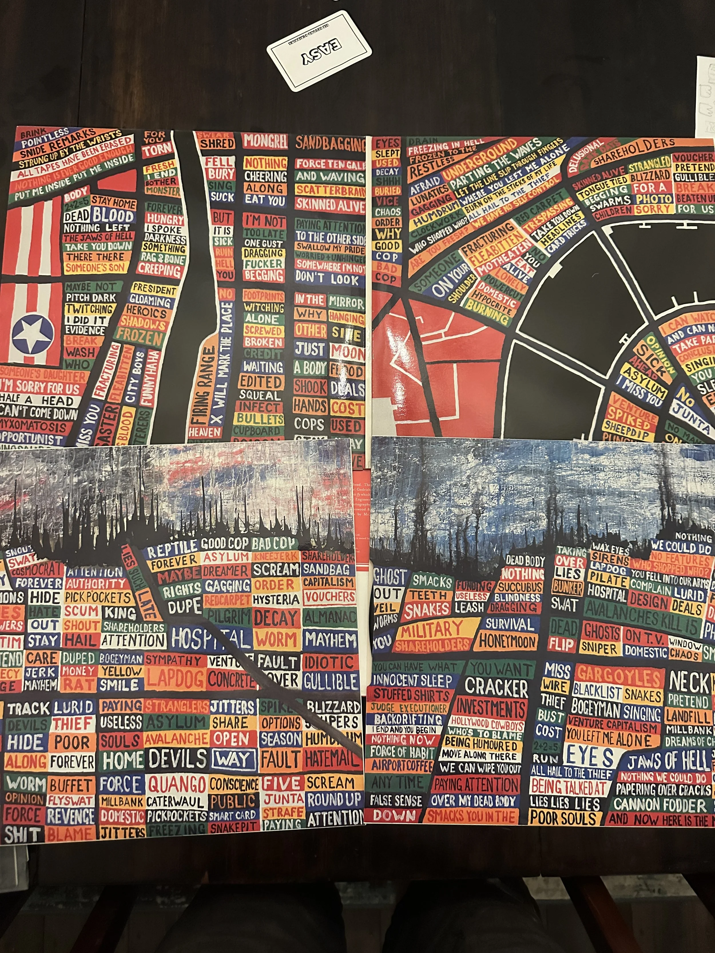
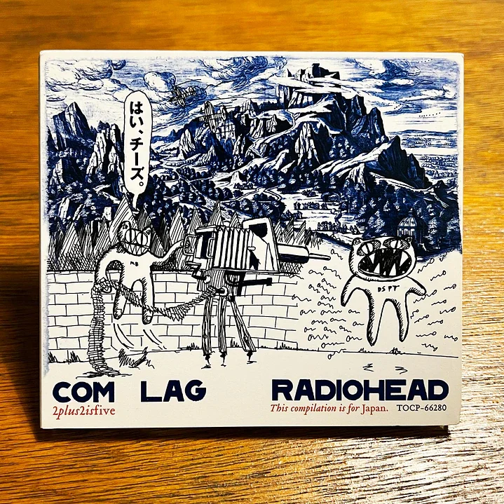
Hail to the Thief
Hard thing here is keeping the numbers down, you could do every image from the LP and singles. It’s so good. Clearly the cover would sell the most but there’s other great bits, maybe a triptych of them? Also the Com Lag stuff which was same period although very different style. More OK Computer era.
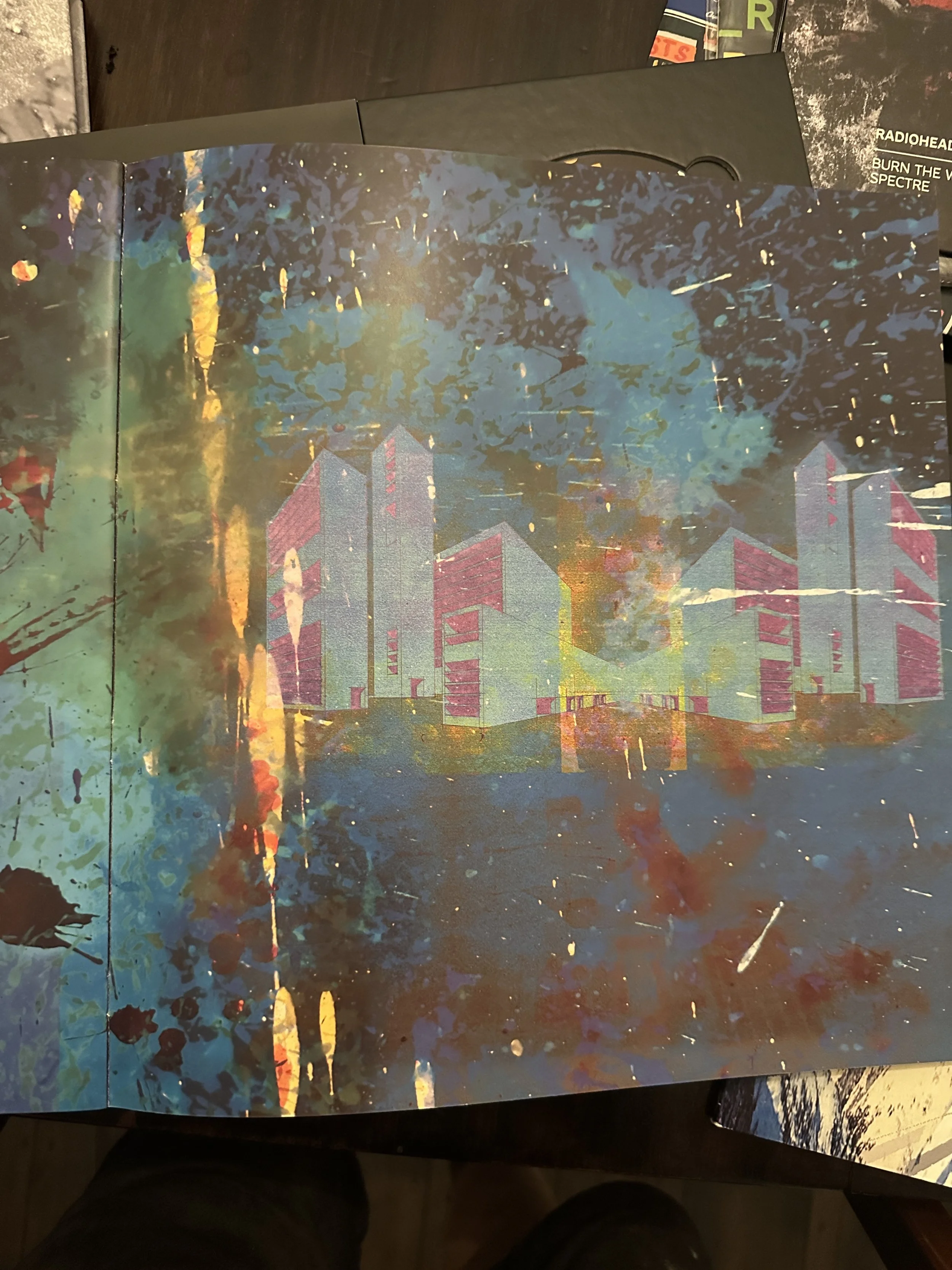
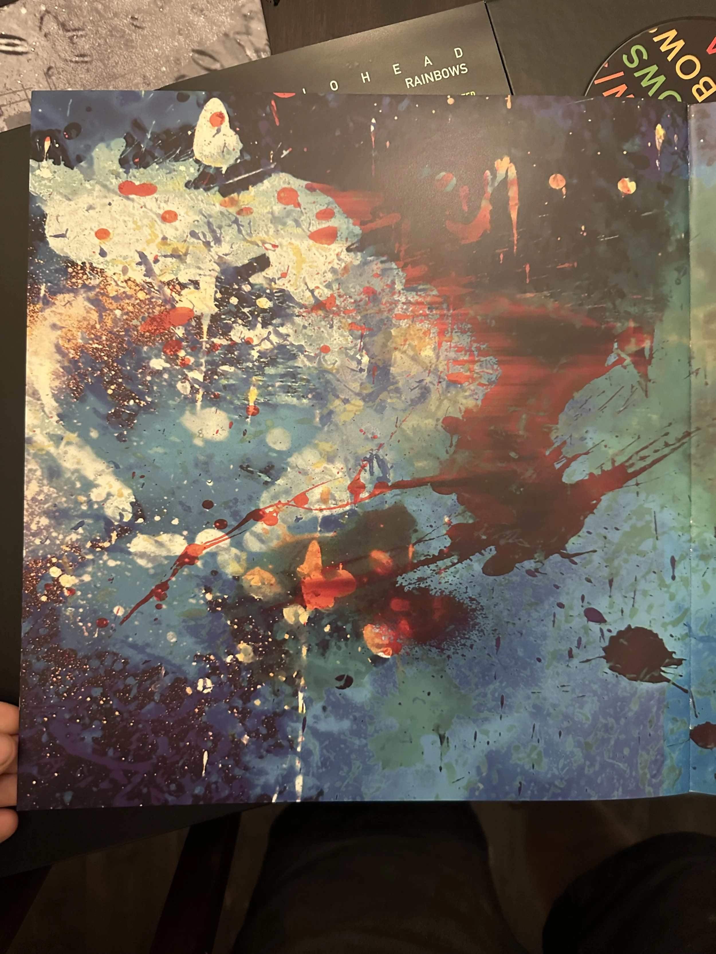
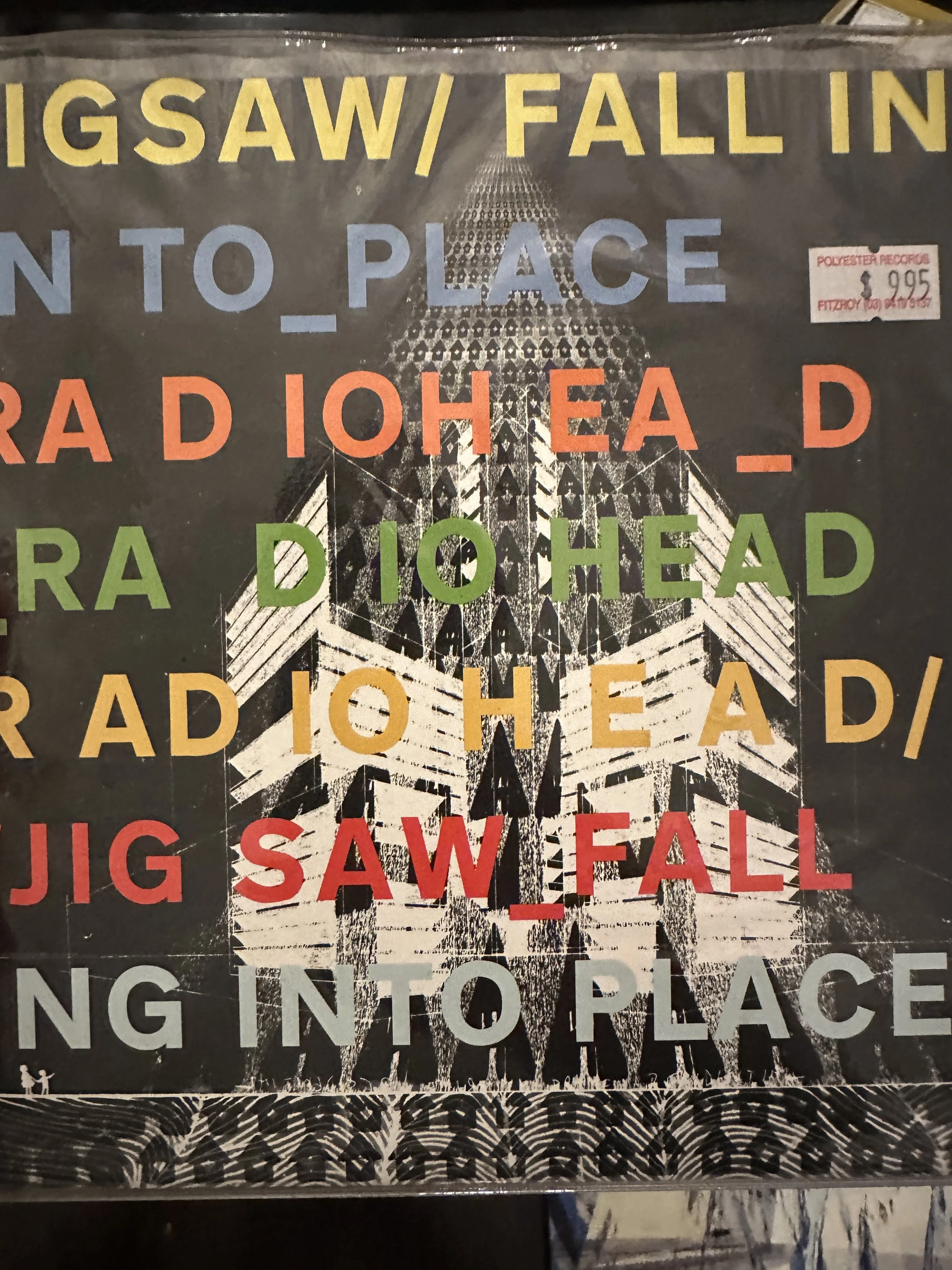
In Rainbows
This one is a pain, I’m a typography chap so I really like all the type work here. Even the tees you did around this time were great, only Radiohead tees I ever wore. But without the type it’s hard to immediately go ‘Oh Radiohead’ unless you’re a proper nerd, BUT oddly they make for really great art pieces. These are my favourite of the many splatters, the first one of the actual cover but with no text. The background of the Jigsaw 7” is also a really cool image.

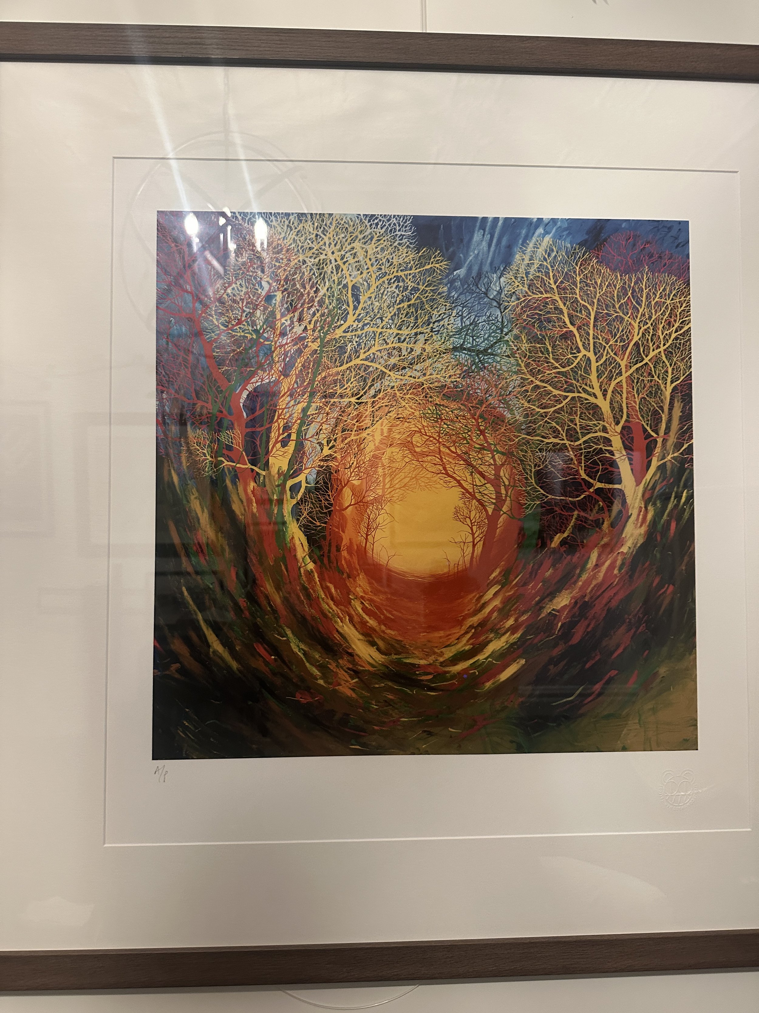
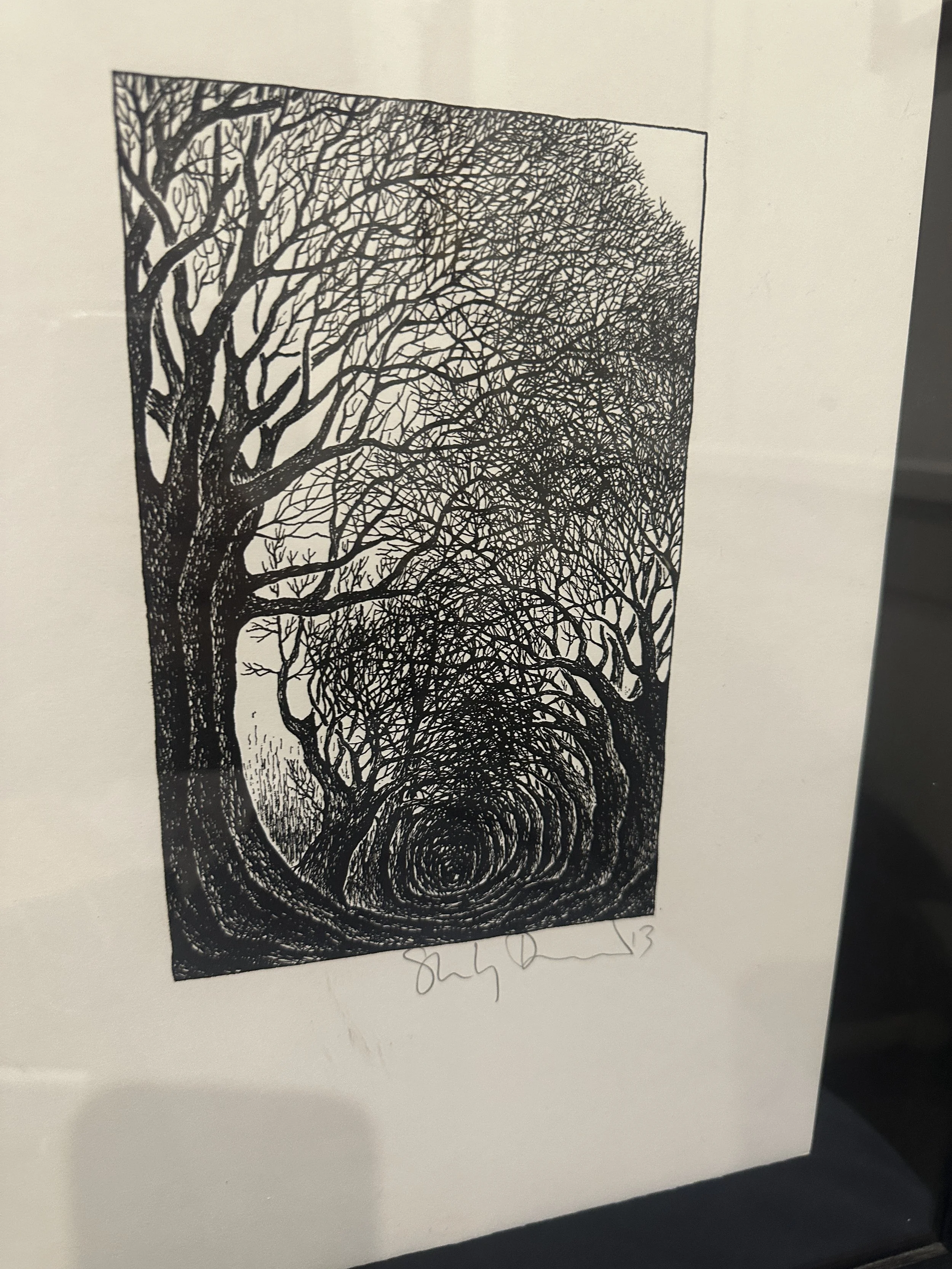
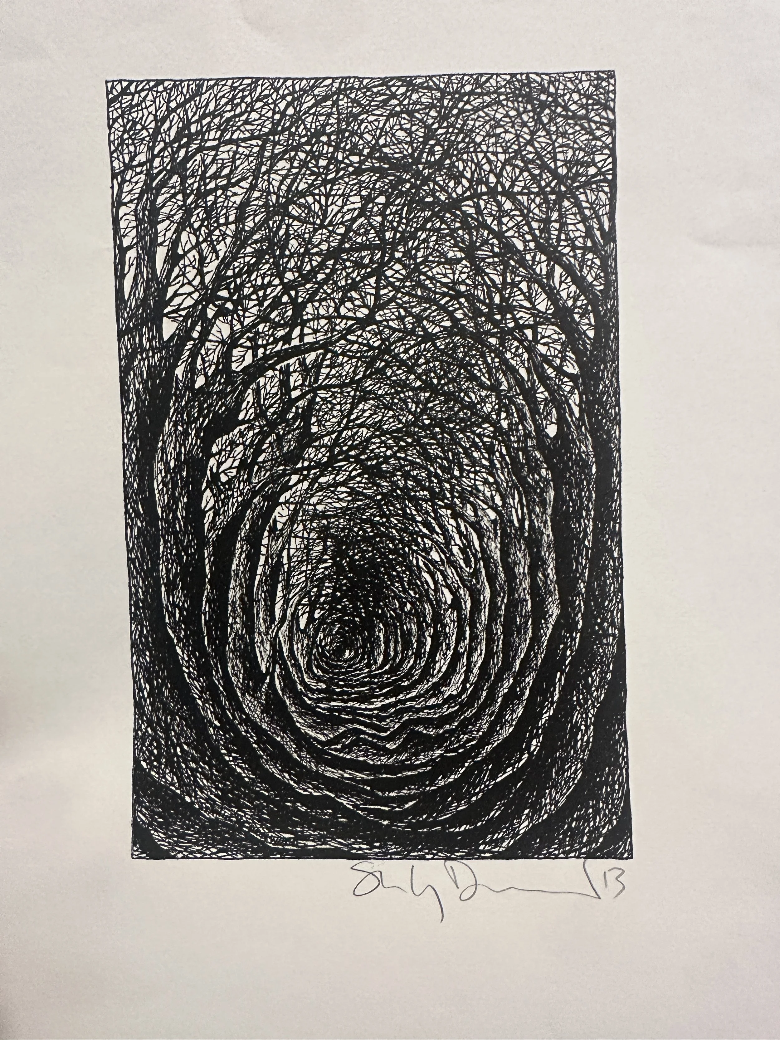
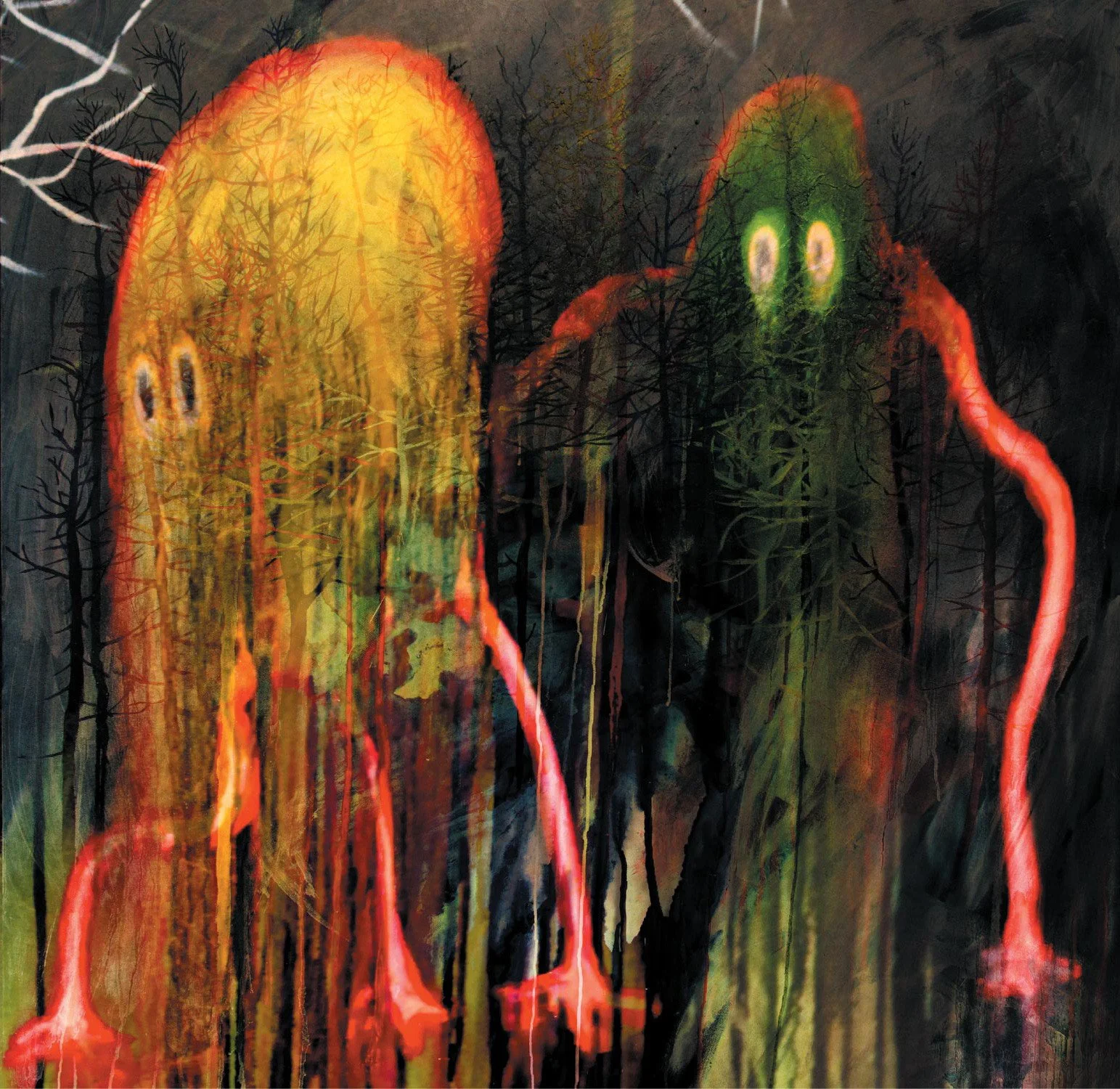
King Of Limbs
I love the back cover of this, it was used huge on a tour poster when they last hit Aus in 2012, it looks great, admittedly better with their name on it though. But I am a bit of a sucker for his tree work. Front cover still works without the text I thought.
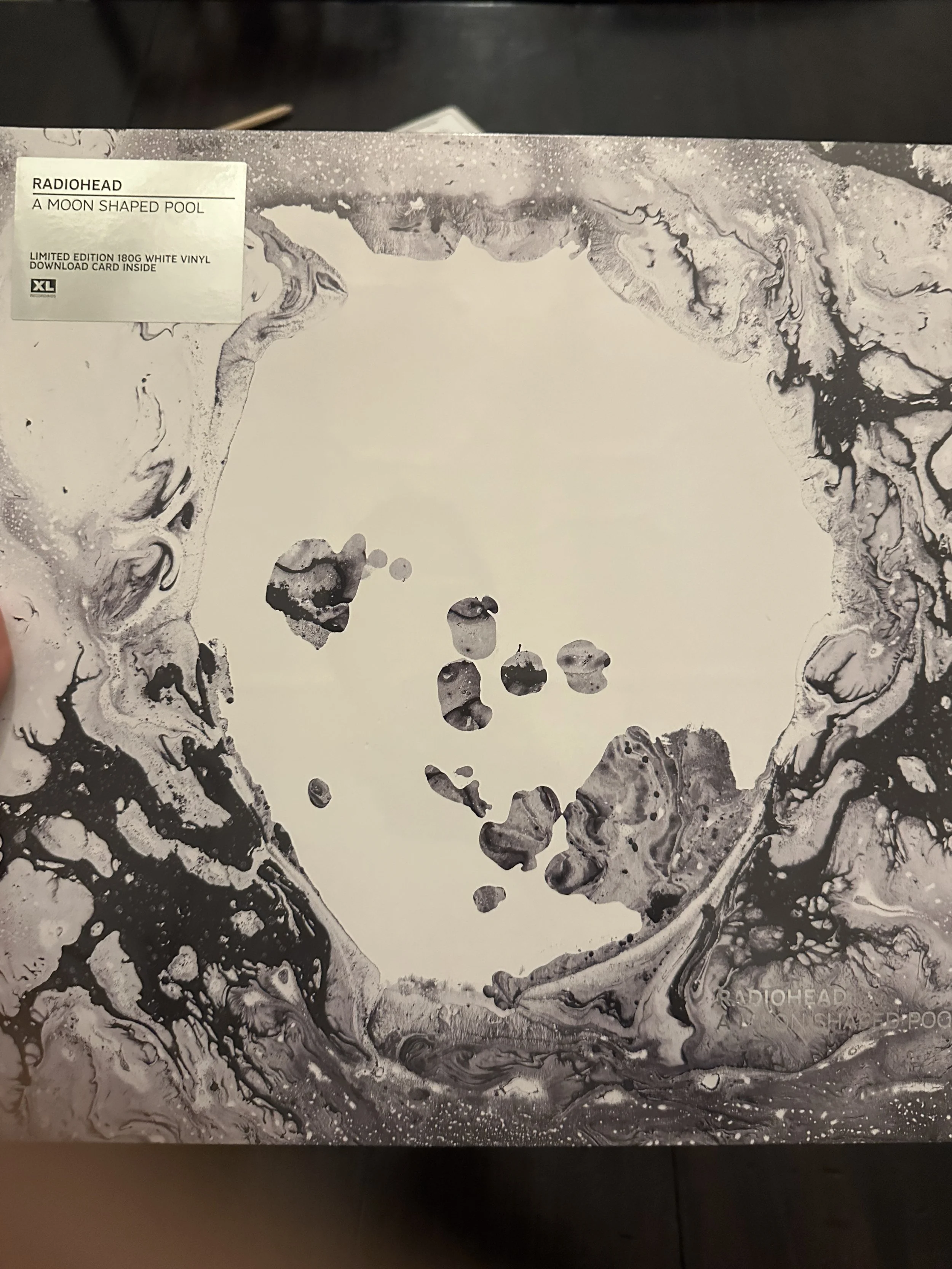
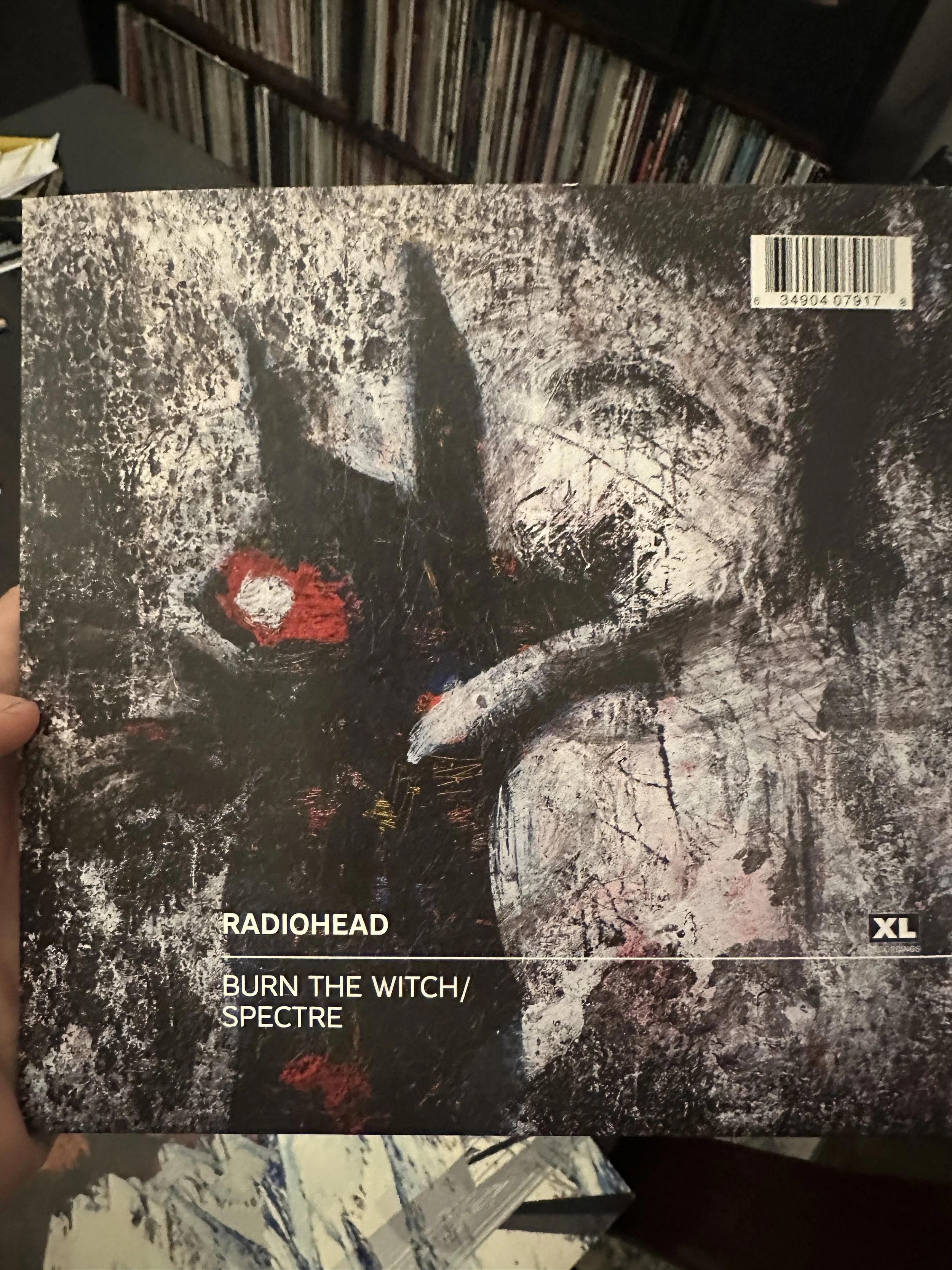
Moon Shaped Pool
I liked this image more when I saw the actual painting. It didn’t do much for me when the album came out, but it didn’t have the colour and madness and chaos of the other albums. It’s not bad, just a hard act to follow, interested to know how it sold vs other album covers actually. I know you have a few variations. Couple of very strong singles so there are big fans out there. I added in the ‘James Bond theme That Wasn’t’ because similar time. I didn’t mind that painting.
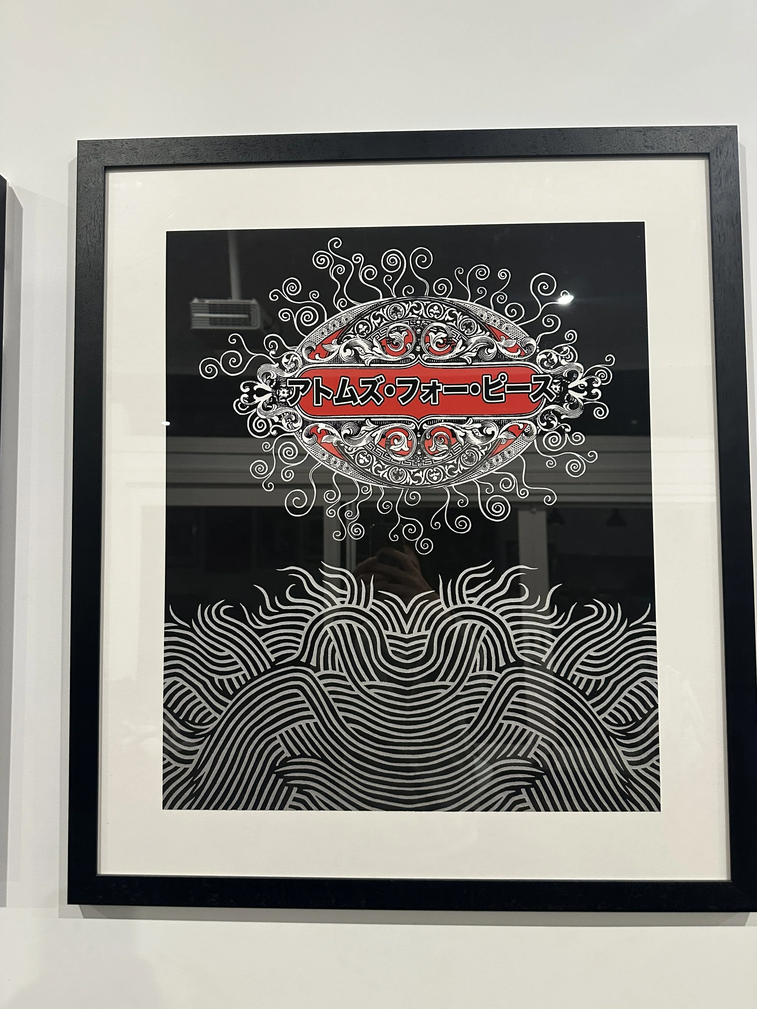
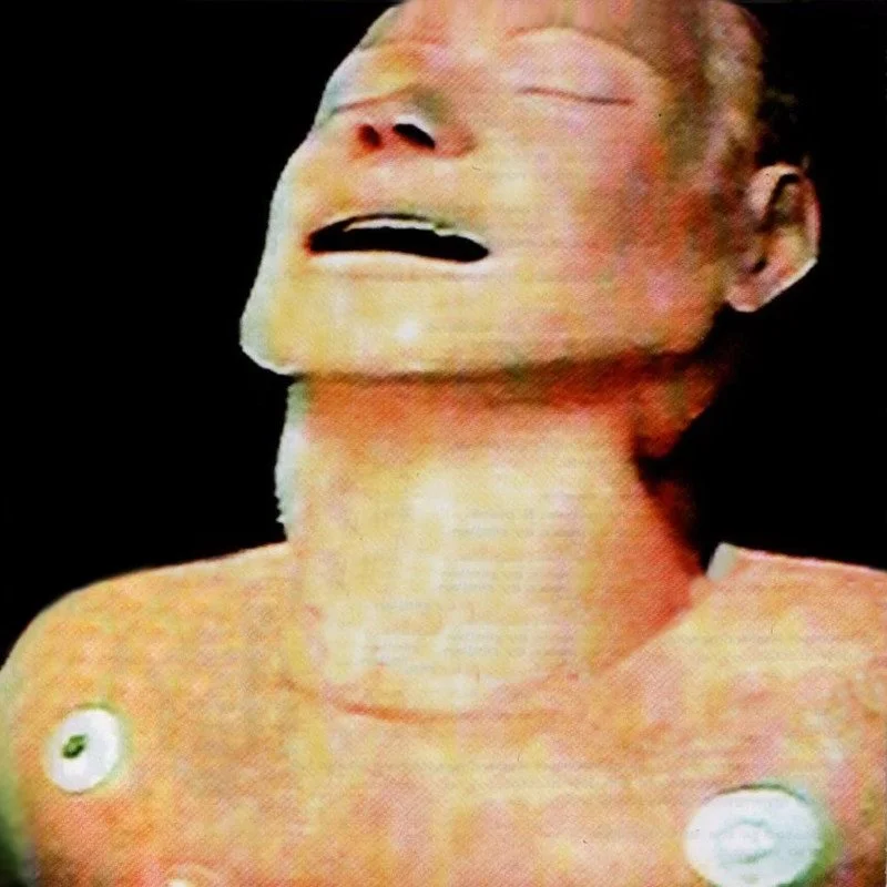
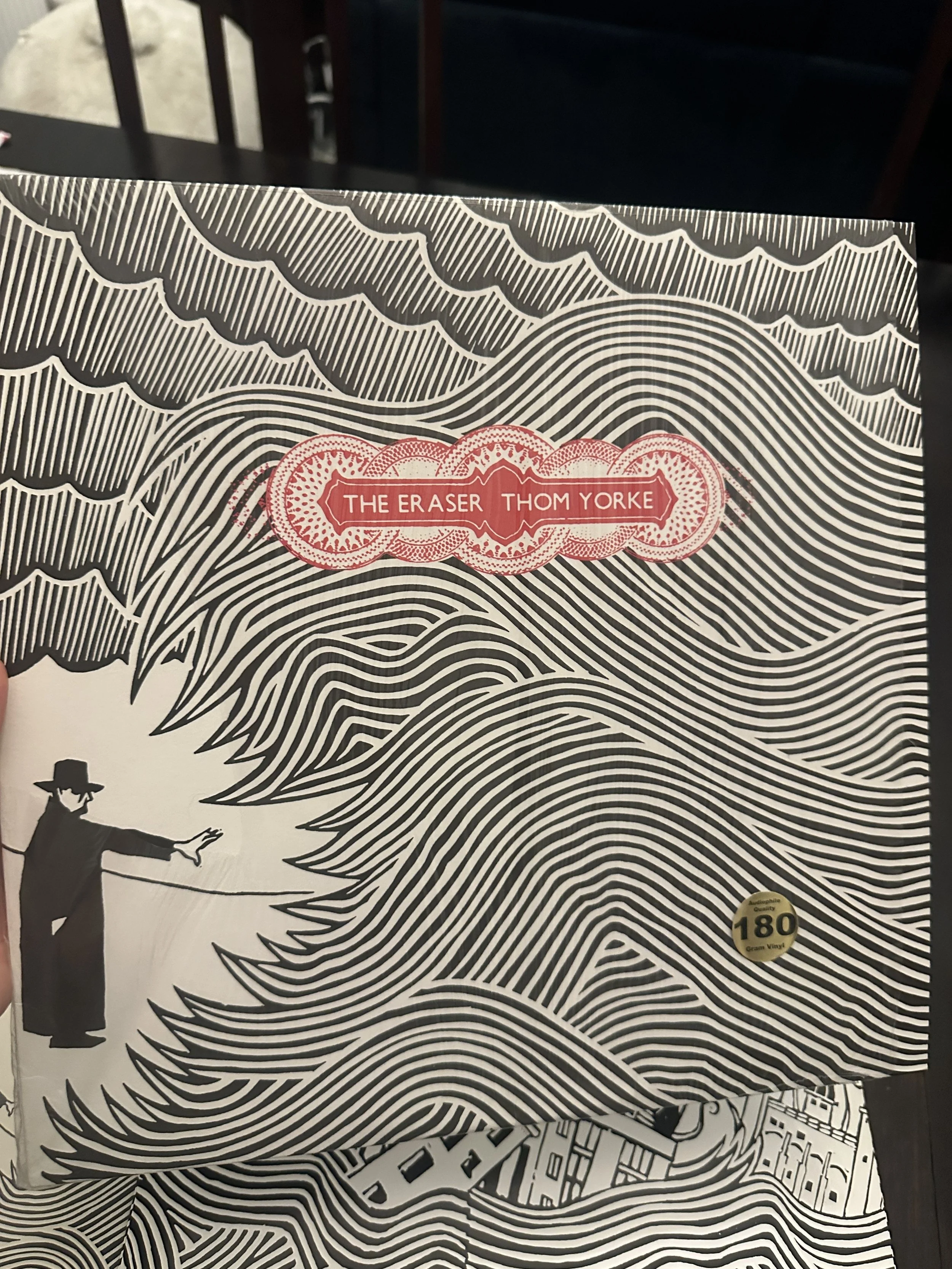
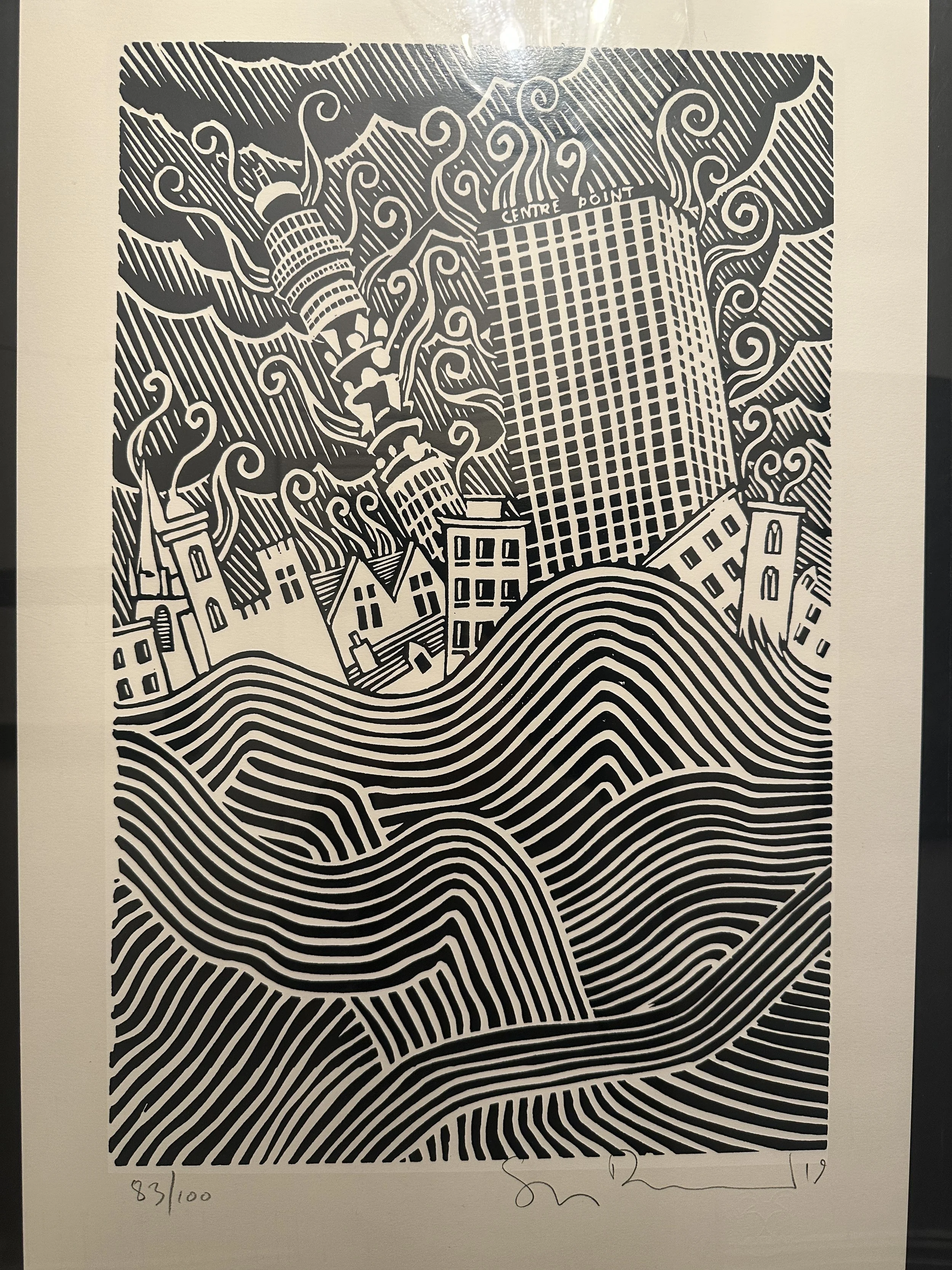
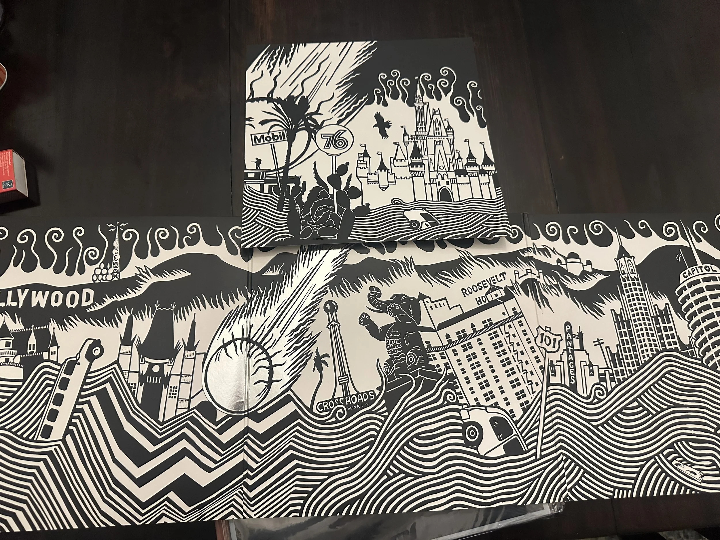
Solo Thom
This stuff is all too good to be true, the whole of Eraser is brilliant, but the cover and the BT Tower are the best bits, maybe with Battersea Power Station. AMOK also too good, picked my favourite part. But I’m sure you won’t reprint all these things again. And you already know what sells.
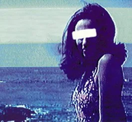
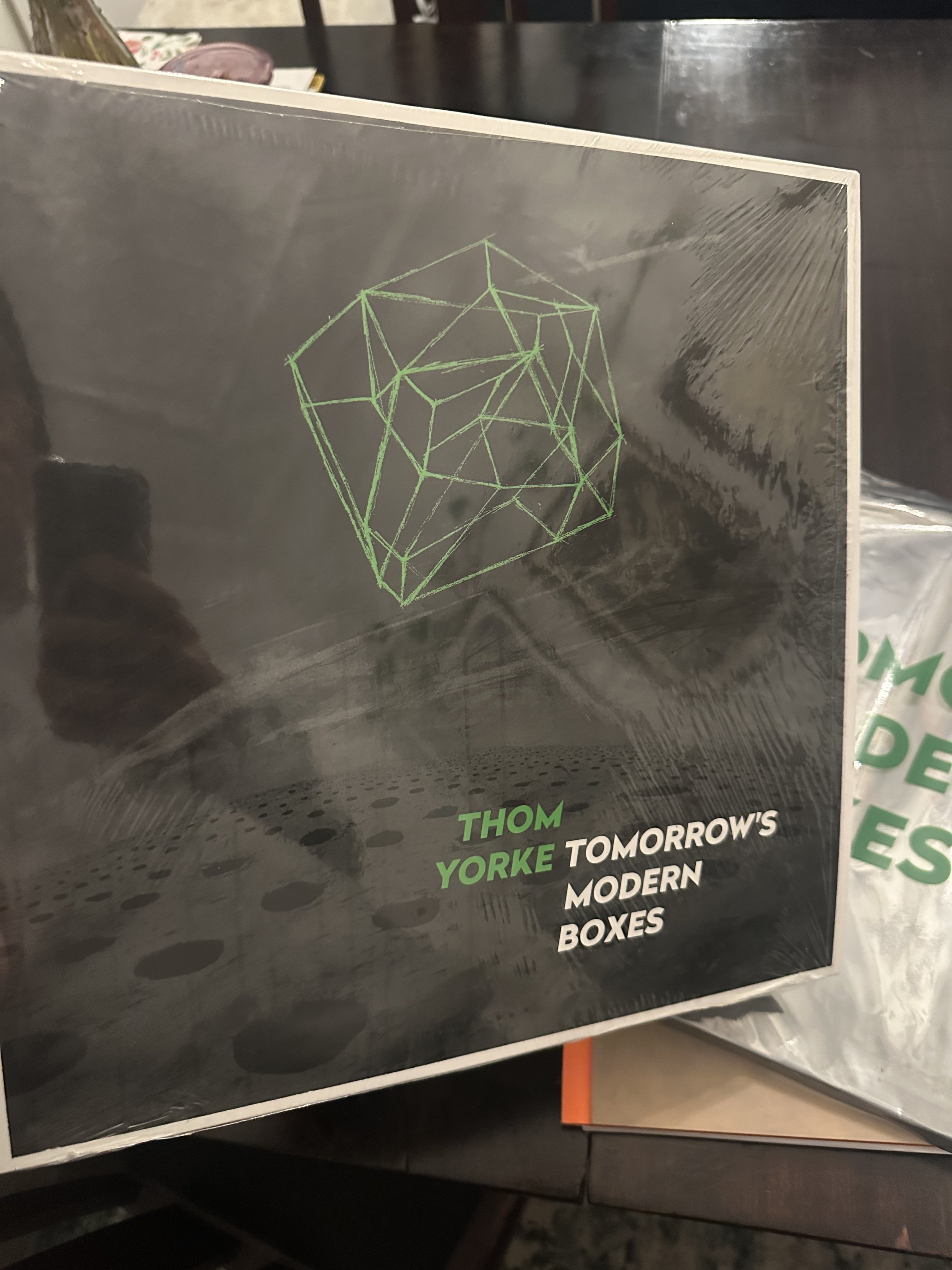
I like the Tomorrow’s Modern Boxes cover a lot, neon green on that desolate landscape. Sadly the album was a bit weak so not sure how much people care about it. Both sides were great.
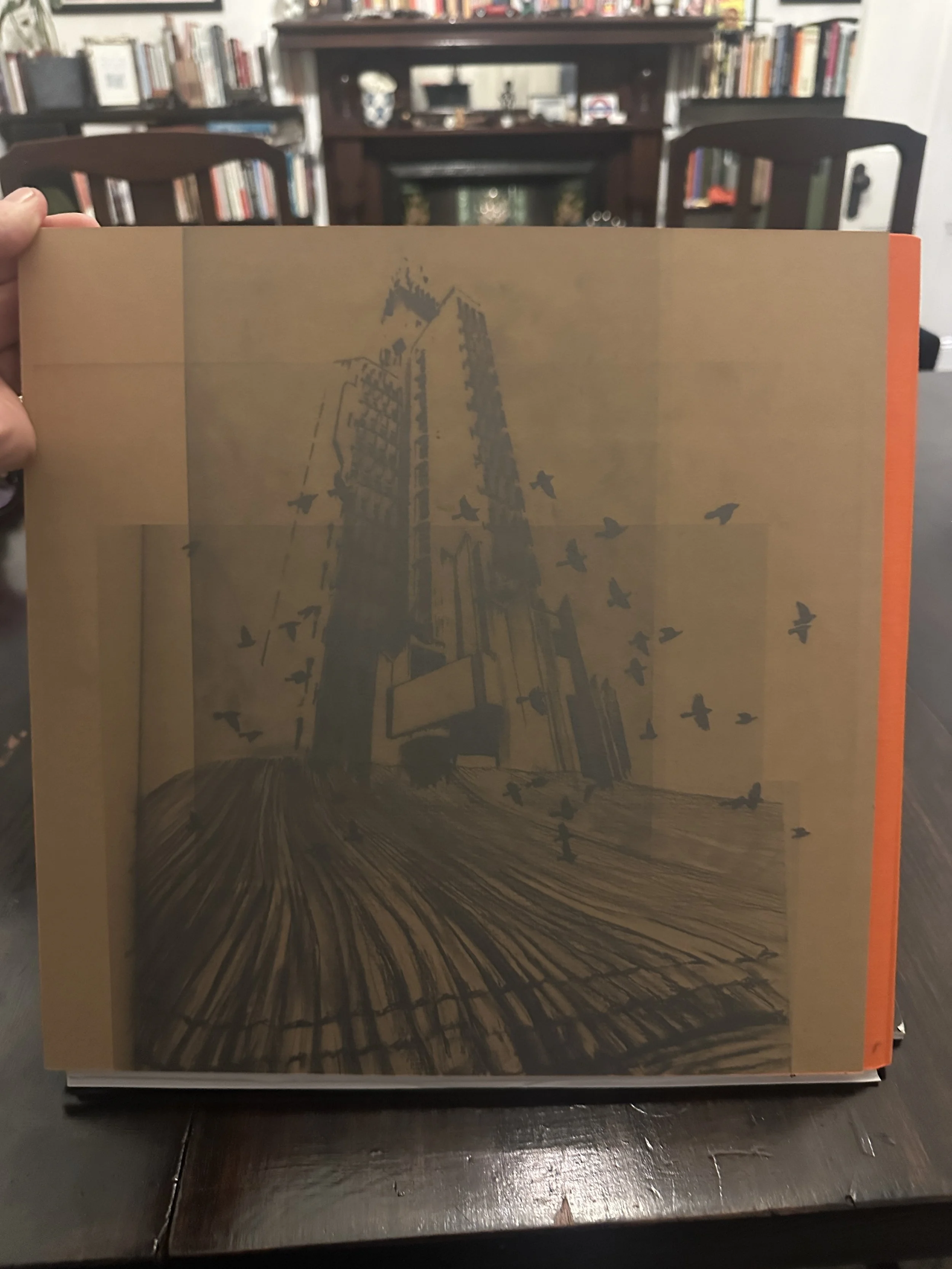
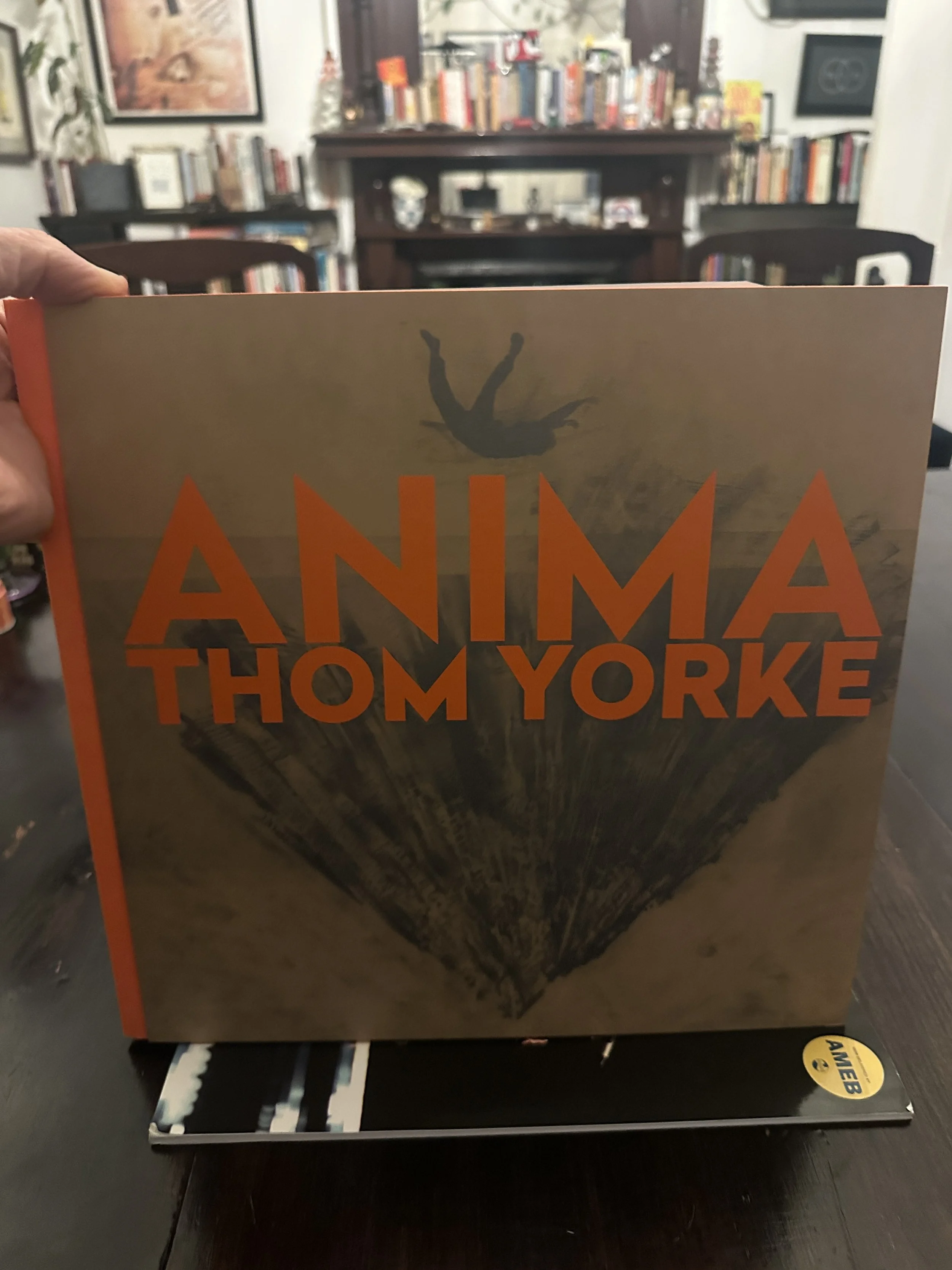
A lot of the Anima booklet was a bit sketchy but the front and back were lovely. Trickier without the bold text, shame there isn’t a neon orange shape to complement the Modern Boxes green

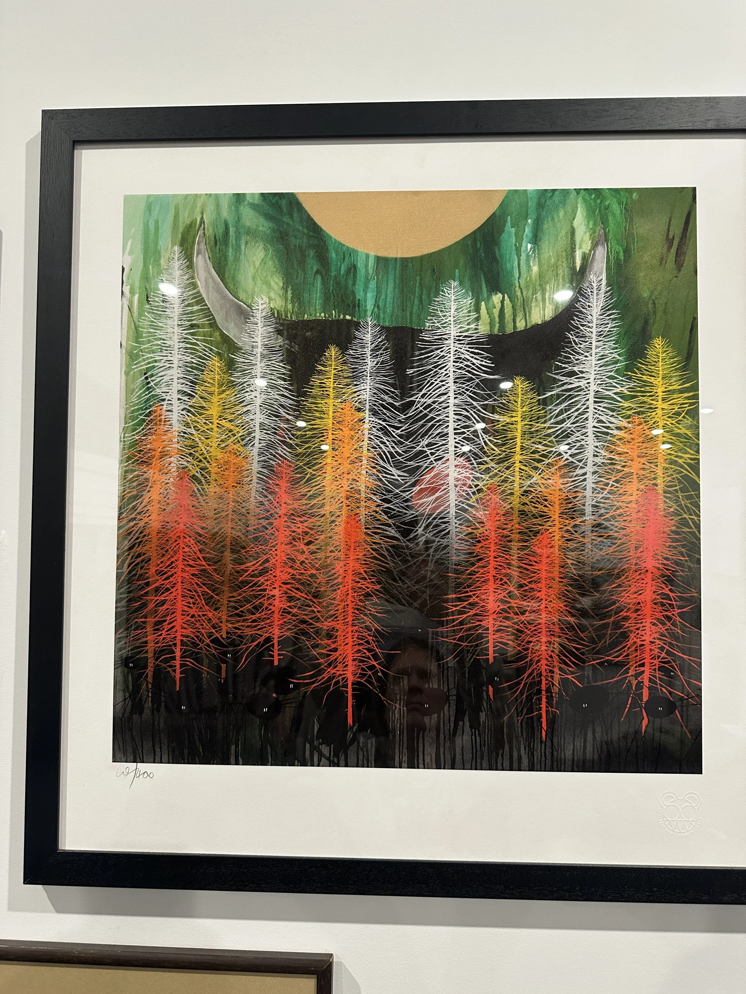
Solo Stanley
He’s a bit of an overachiever so slightly too much to wade through, and not sure how off Radiohead topic you want to go, (or maybe you want to make it feel more Stanley than Radiohead for plausible deniability?) but here’s a few of my absolute favourites of his that I think would still appeal to the fans. (You can see I have a tree problem, but those holloway prints I adore)